
Imagine walking into an empty room. The bare walls reflect the harsh light from outside, the floor echoes with every step, and the gaze wanders, searching for a reference point. There is immense potential in front of you, almost palpable, but also a subtle sense of trepidation: where to begin? How can you transform this space into a haven of comfort, refinement, and personality?
Of course, there are challenges. The colour palette can seem overwhelming, and every choice of furniture, fabric, or accessory can either enhance the room's atmosphere or risk creating a visually overwhelming or impersonal area.
At these times, interior design becomes a true strategic art. More than intuition, it requires a method. And this is where the 60-30-10 rule, a key principle in interior design, can provide the balance and sophistication you seek. More than a strategy or a technique, it is an approach that allows you to organize the proportions of colours in the space, creating a sense of symmetry and balance but also of sophistication that you feel as soon as you walk through the door.
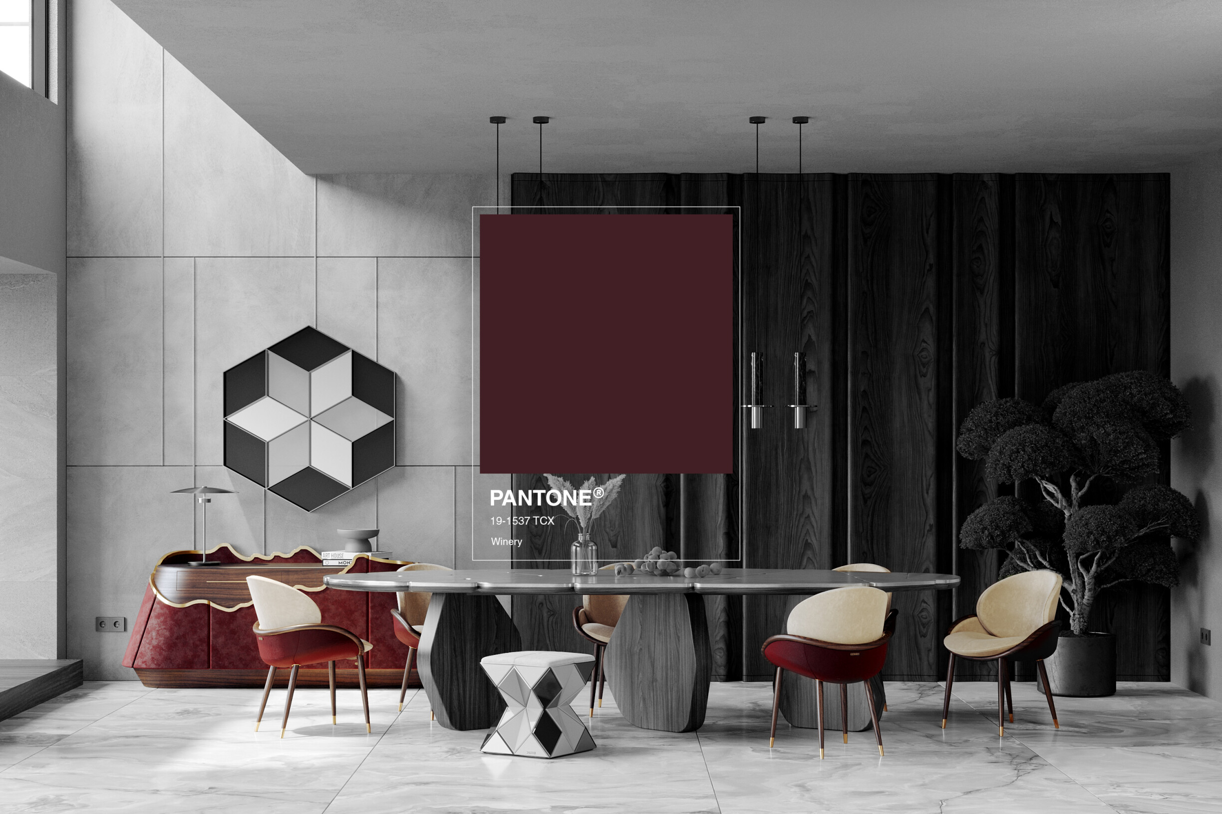
With the careful application of this rule, even the most expressive shades — such as the deep and enveloping Wine Red, the colour of the year by ALMA de LUCE — find their place.
Although widely recognized in contemporary interior design, the 60-30-10 rule originates in colour theory and visual psychology fundamentals. Its roots go back to the need to create balanced spaces, in which colour is a strategic tool that guides the eye and evokes emotions and sensations.
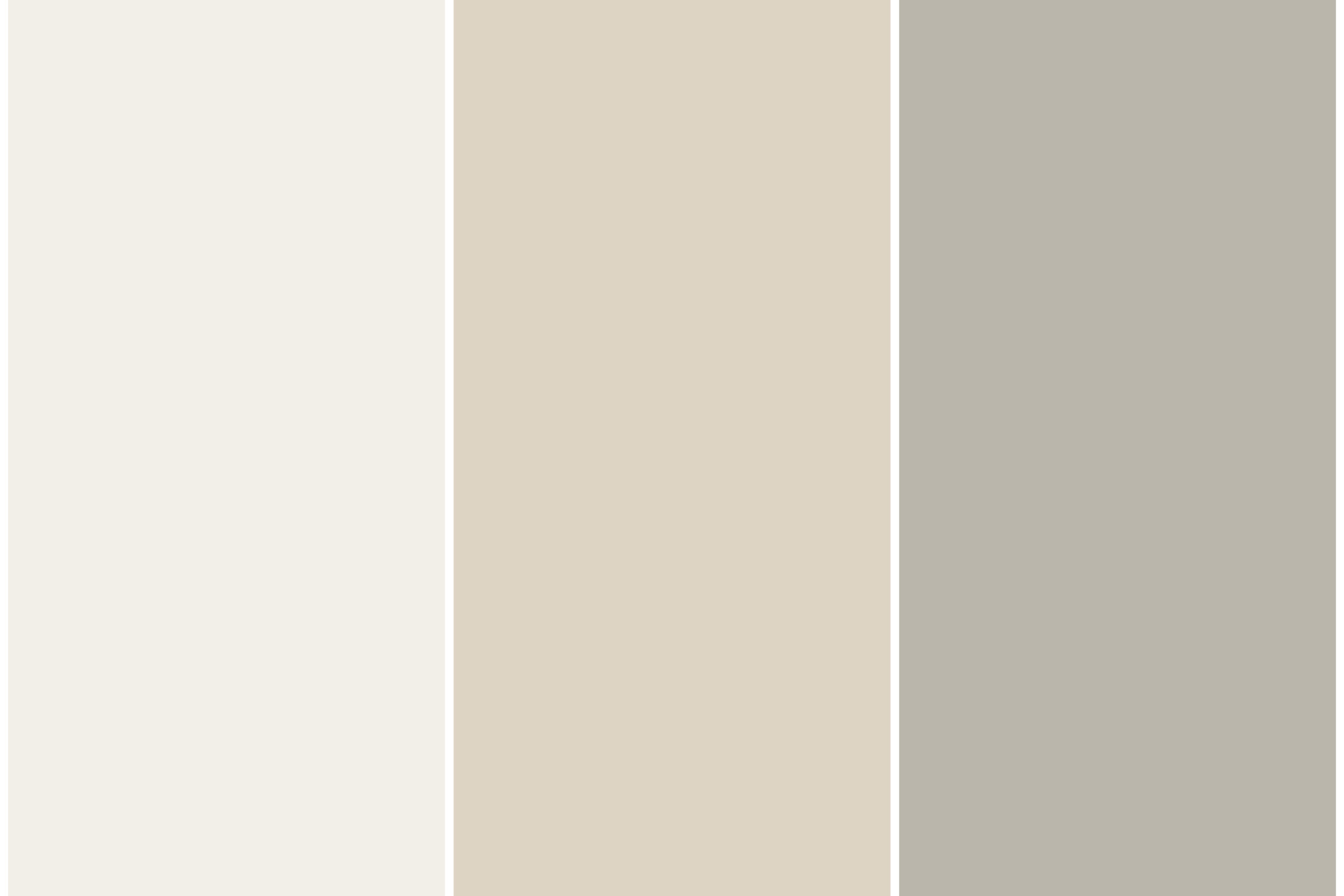
The 60-30-10 rule is a straightforward concept. As its name suggests, it involves distributing colours in a space in proportions of 60%, 30%, and 10%. This simplicity is what makes it so effective!
But what do we mean by 60-30-10?
The 60% corresponds to the dominant colour, the one that defines the visual base of the space. It is normally applied to walls, large surfaces, and structural elements.
The 30% refers to the secondary colour. It is the shade that complements the dominant colour and introduces a subtle contrast, giving the space dimension and dynamism.
Finally, the remaining 10% should be dedicated to the standout details that capture attention and bring the composition to life.
Don't consider this rule to be a color scheme. Interpret it as a method of visual composition that can create harmony without rigidity and freedom without disorder.
Applying the 60-30-10 rule is more intuitive than it seems, especially when you follow clear logic and respect the personality of each space.
1. Always start with the emotion you want to convey
Before thinking about chromatic trends or choosing any colour, think about the space you are creating. What are the project objectives? What emotion do you want to convey? The truth is that whether it is serenity, energy, sophistication, or luxury, the dominant tone should reflect that intention. For example, neutral and soft colours as a base allow you to create a calm and welcoming backdrop in a relaxing space.
2. Use secondary colour to create depth
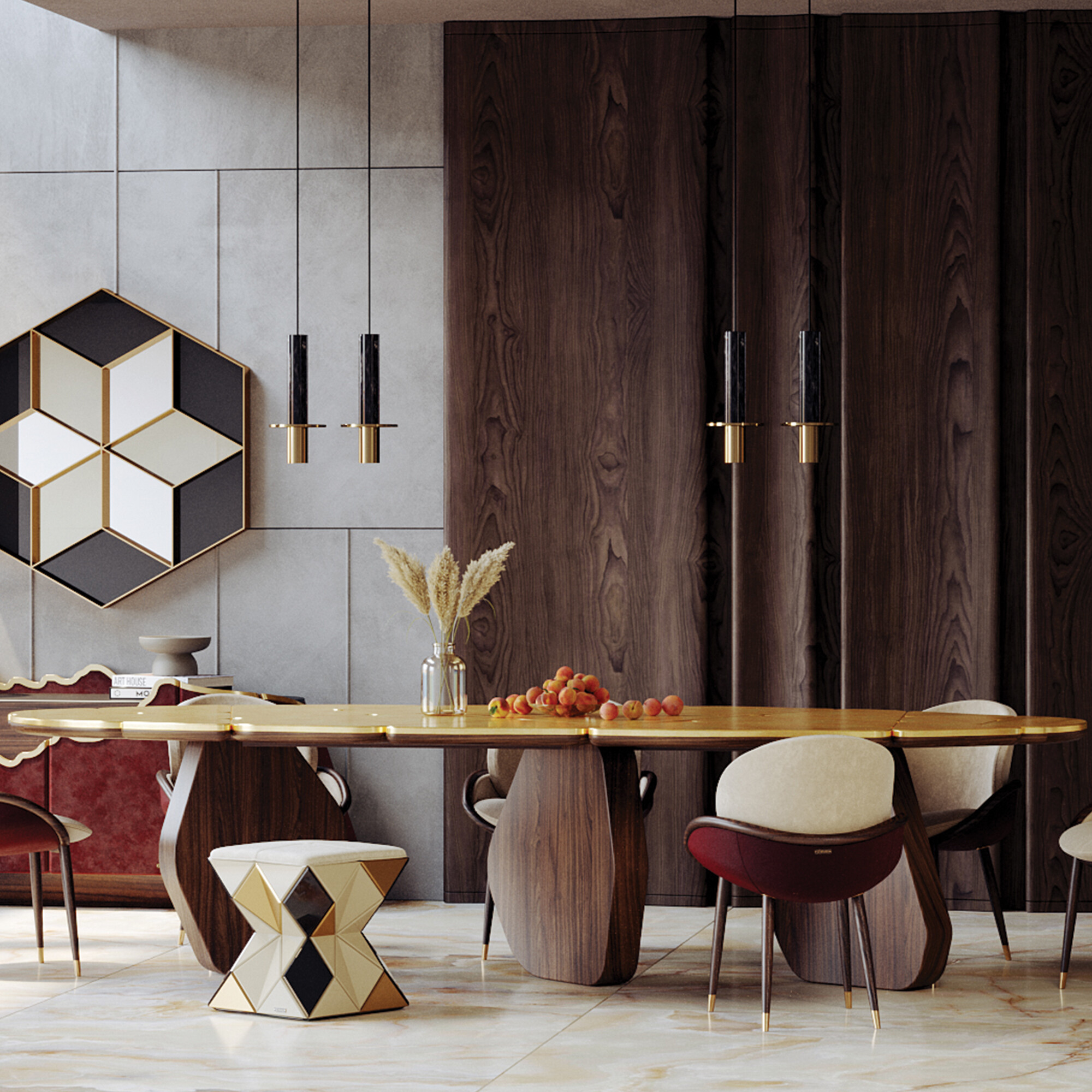
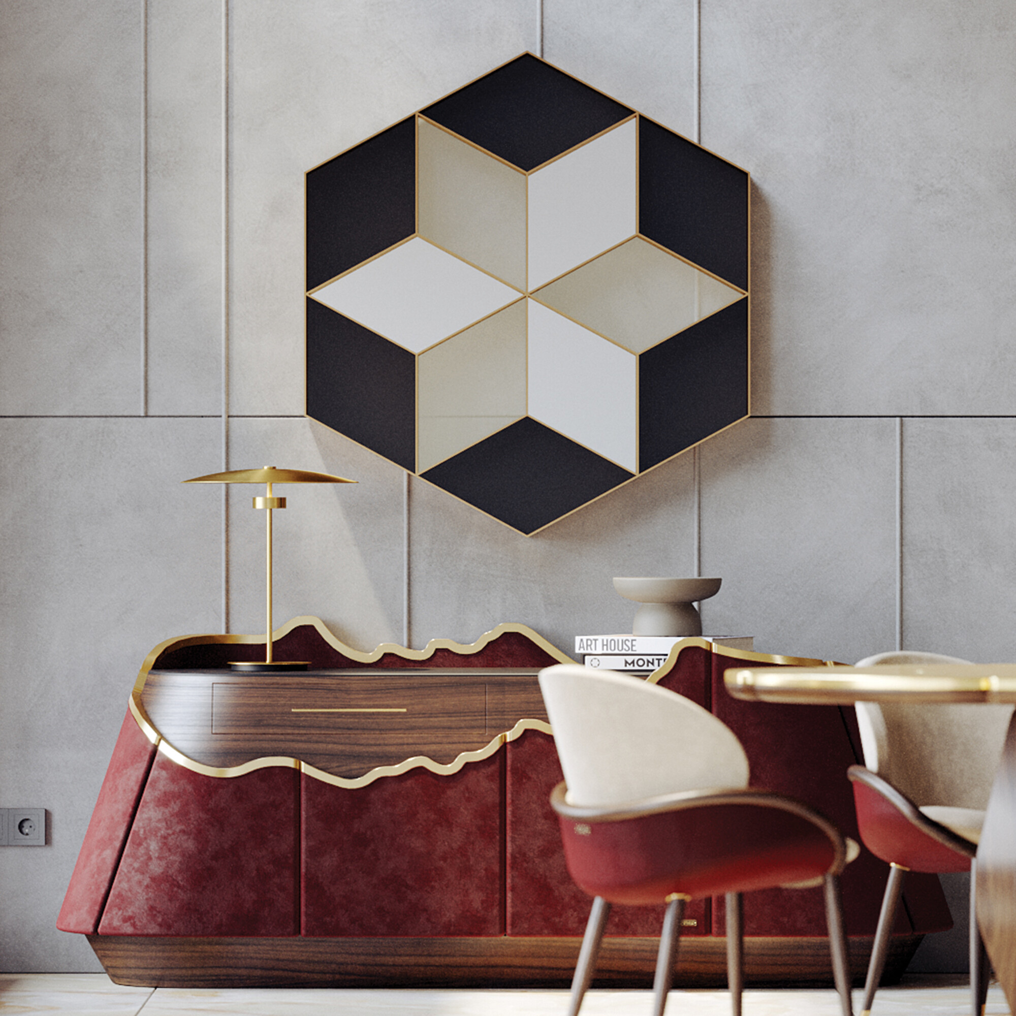
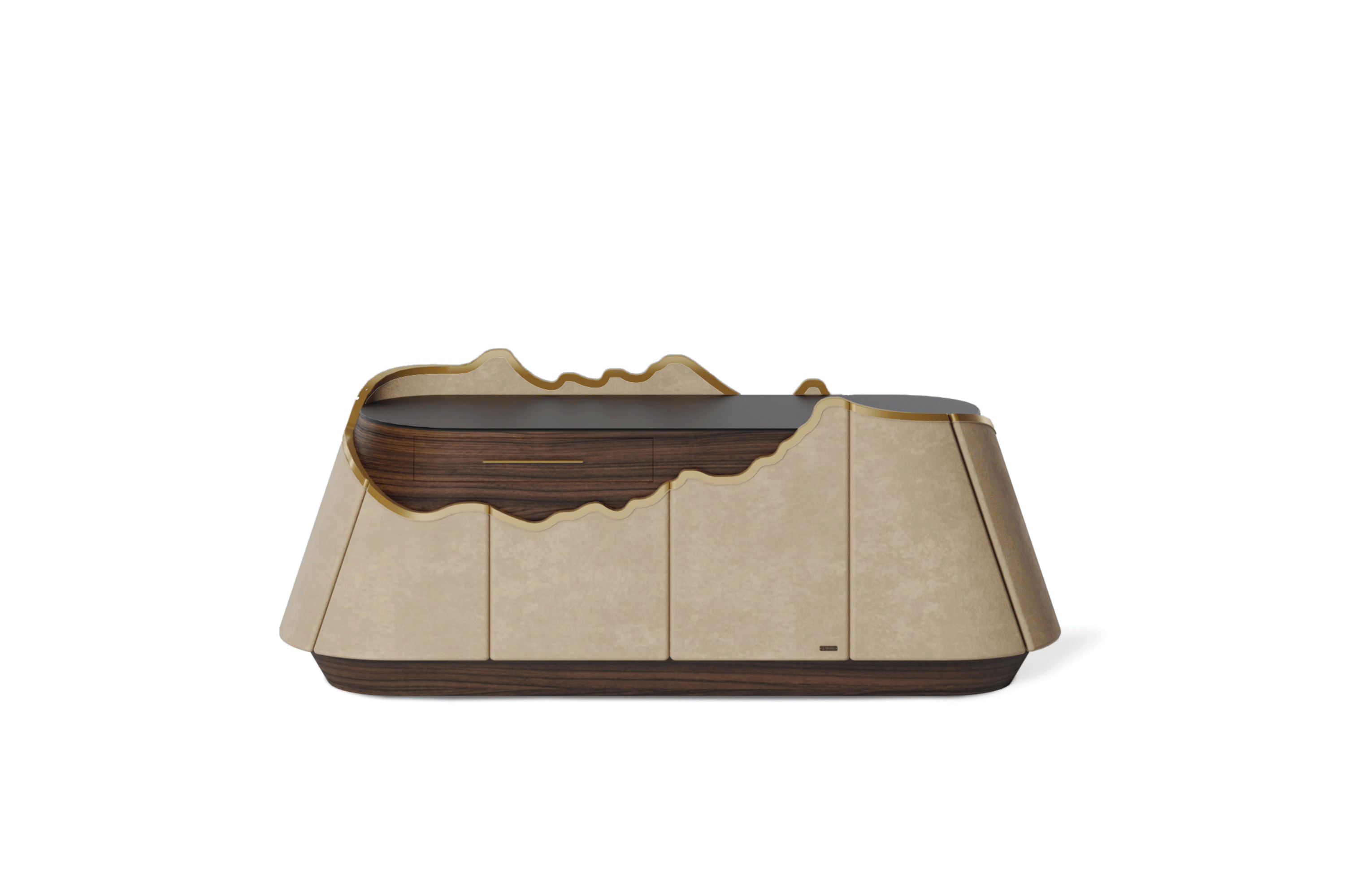
The secondary colour complements the dominant one. It does not exist to compete but to complement. Choose a tone that works well with the dominant shade and apply it strategically to larger furniture or accessories. Imagine the Atacama sideboard from ALMA de LUCE, reinforcing the set's elegance without dominating it.
3. Give personality with the 10% highlight
This is where you can take a risk! Opt for vibrant textures or shades to make a difference. The colour Wine Red, for example, is perfect for adding a sophisticated and modern touch. Think about cushions, vases, or uniquely designed lamps that give vitality and expressiveness to the space.
Choosing the right colours for a room allows you to create a specific atmosphere that makes sense for whoever uses the space. When applying the 60-30-10 rule, the first step is to define the main colour, which will be the base of the room. The second step is to choose the secondary colour, which will add harmony and depth. Finally, we took advantage of the accent colour to give personality to the space. But how can these choices create a harmonious space with a luxurious aesthetic?
The main color, the predominant color in the space, should fill 60% of the palette. This color is the main visual background, so it must support the rest of the design.
Neutral tones, such as white, gray, or beige, or even softer colours, such as light blue or mint green, are perfect for the main tones. This way, you will be creating a feeling of tranquility and spaciousness. However, this doesn’t mean you can’t opt for deeper colours, especially if the design goal is a sophisticated and welcoming atmosphere.
The secondary colour corresponds to 30% of the colour palette and complements the main colour. This shade should contrast gently to bring complexity to the space without competing with the dominant shade. To achieve this visual harmony, choosing a tone in the same colour family is essential or creates a subtle contrast with the main colour.
Let's look at an example. If the main colour is neutral, such as light gray, the secondary colour can be more vibrant, such as dark blue or wine red.
The remaining 10% should be filled with the accent colour. In this case, the goal is to be bold so that this colour adds energy to the space. This is the time to be more creative, and you can choose vibrant colours or contrasting textures that attract the eye and create points of interest in the room.
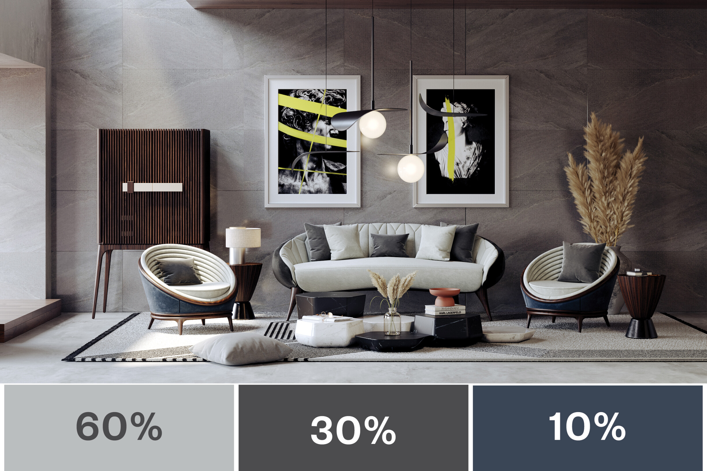
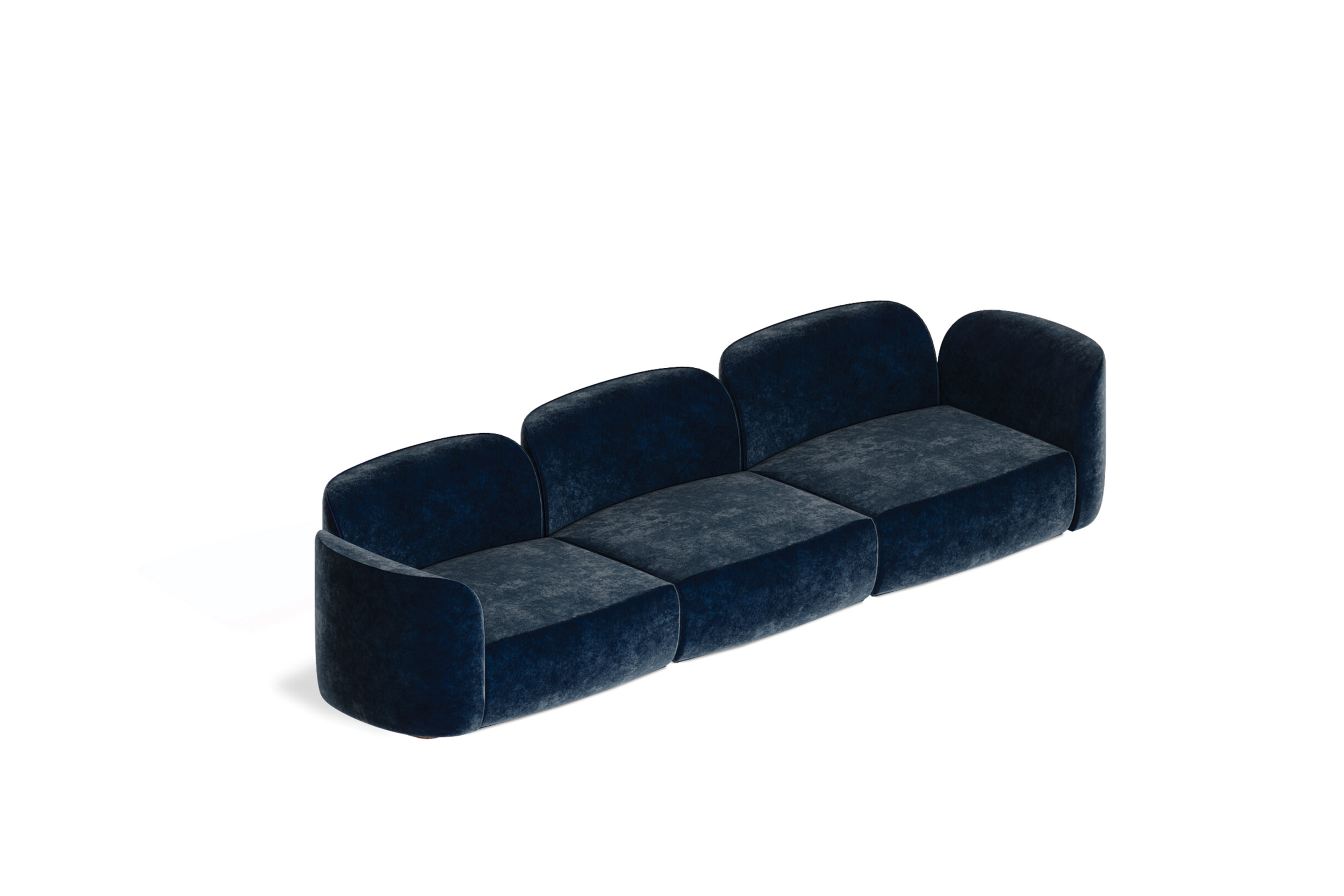
For a more sophisticated approach or luxurious aesthetic, you can choose a piece like the Marqueyssac modular sofa by ALMA de LUCE. Its blue accent makes it the real focal point without overwhelming the room.
Applying the 60-30-10 rule goes far beyond walls. Taking advantage of the potential of this approach when choosing furniture, fabrics, and accessories is a strategy that ensures cohesion and elegance in spaces.
The main furniture, which represents 60%, defines the visual base of the room. An elegant dining table like the Adamastor from ALMA de LUCE establishes the visual balance of the room.
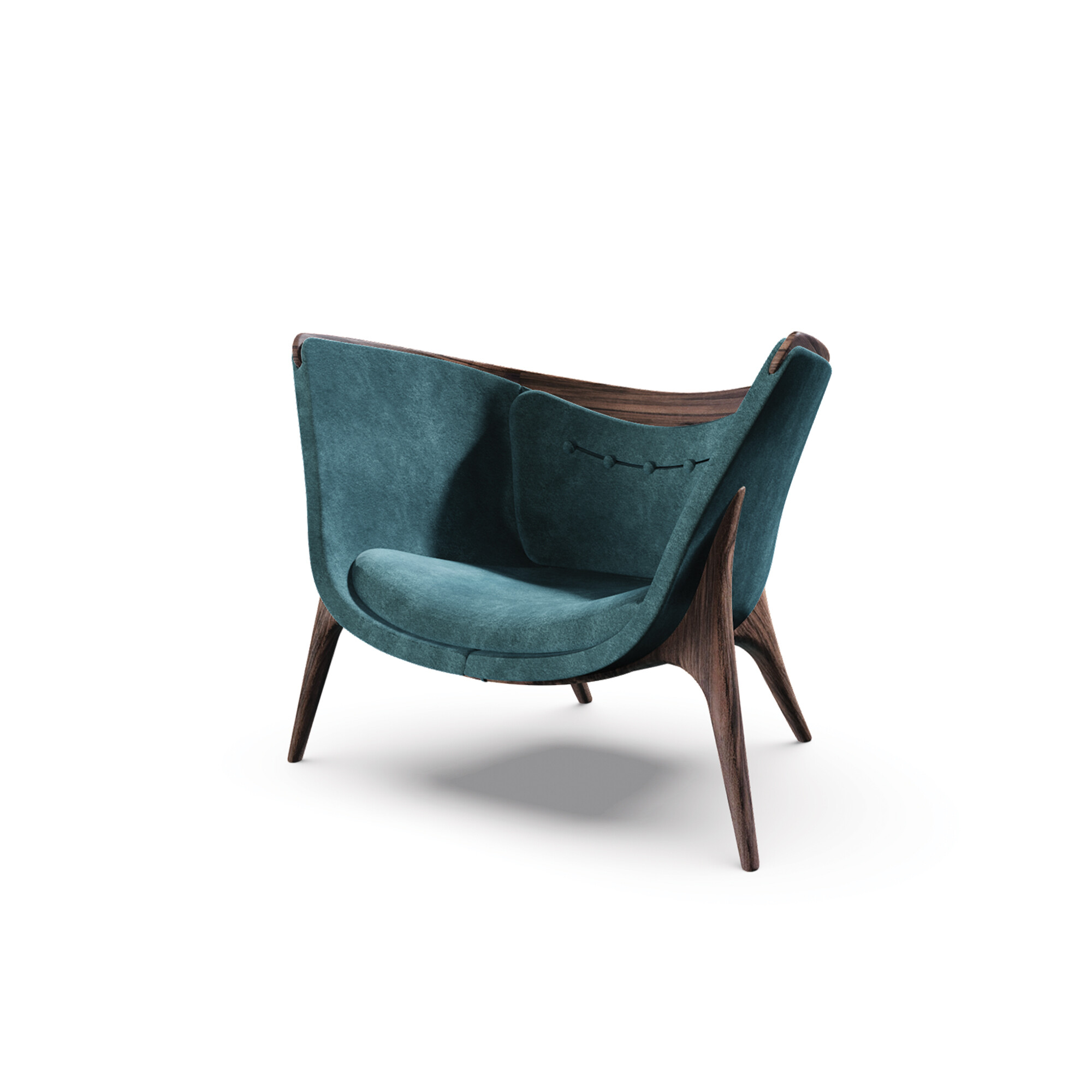
We move to 30%, where secondary colour elements bring contrast and depth to the area. The Hissan Arabi armchair by ALMA de LUCE adds personality without overwhelming the space.
Accessories and details make up 10% of the total and are the standout pieces that catch the eye. Pillows, lamps, or vibrant pieces of art are ideal examples. These touches bring energy and create focal points that enliven the whole without dispersing the harmony.
Finally, we cannot forget the importance of textures and materials. A space becomes truly interesting when you combine fabrics like velvet with fine wood and shiny metals.
The essential thing is to ensure that each choice respects this proportion, creating a fluid connection between all the components of the decoration. When applied well, the 60-30-10 rule transforms any space into an elegant reflection of balance and personality.
A space's visual harmony does not arise by chance. It is the result of conscious choices of attention to detail that transform ordinary spaces into memorable scenes. The 60-30-10 rule is a powerful tool precisely for this reason: it offers a simple framework for creating balance and sophistication while respecting each space's personality.
By applying it, you distribute colours with intention and create areas that exude elegance and comfort. It's the difference between a space that exists and a truly felt space.
See some inspirations on Alma de Luce's Pinterest that may help you understand how to apply this rule and suit your needs, tastes, or client's desires. Once you've gained inspiration, would you like assistance in initiating the process? Contact us here. 😉
Furthermore, stay tuned to our blog for more information and curiosities from the universe of architecture, interiors, and design!


