“Balance is achieved through scale, symmetry and both the proportion of the pieces in a room and the room itself”
Bradley Odom, American interior designer
Like a carefully composed symphony, each element in a space needs to play the right note. Too much weight on one side and the area loses its harmony; a lack of proportion makes the space sound out of tune, leaving a sense of unease in the air. Balance in interior design is not just a technical issue. It is a silent language that expresses what we feel when walking through a room.
Symmetry and balance are concepts that intertwine and shape spaces that communicate calm and purpose. Ultimately, each decorative piece, each chosen piece of furniture, or each precisely positioned lamp plays a role in this subtle dance, where the absence of excess allows opposites to complement each other. Just as in nature, where the reflection of a tree in a mirrored lake makes us feel peaceful, the harmonious design does not need to be obvious to be felt.
This article will explain how symmetry and balance are decisive in spaces' aesthetics, functionality, and comfort.
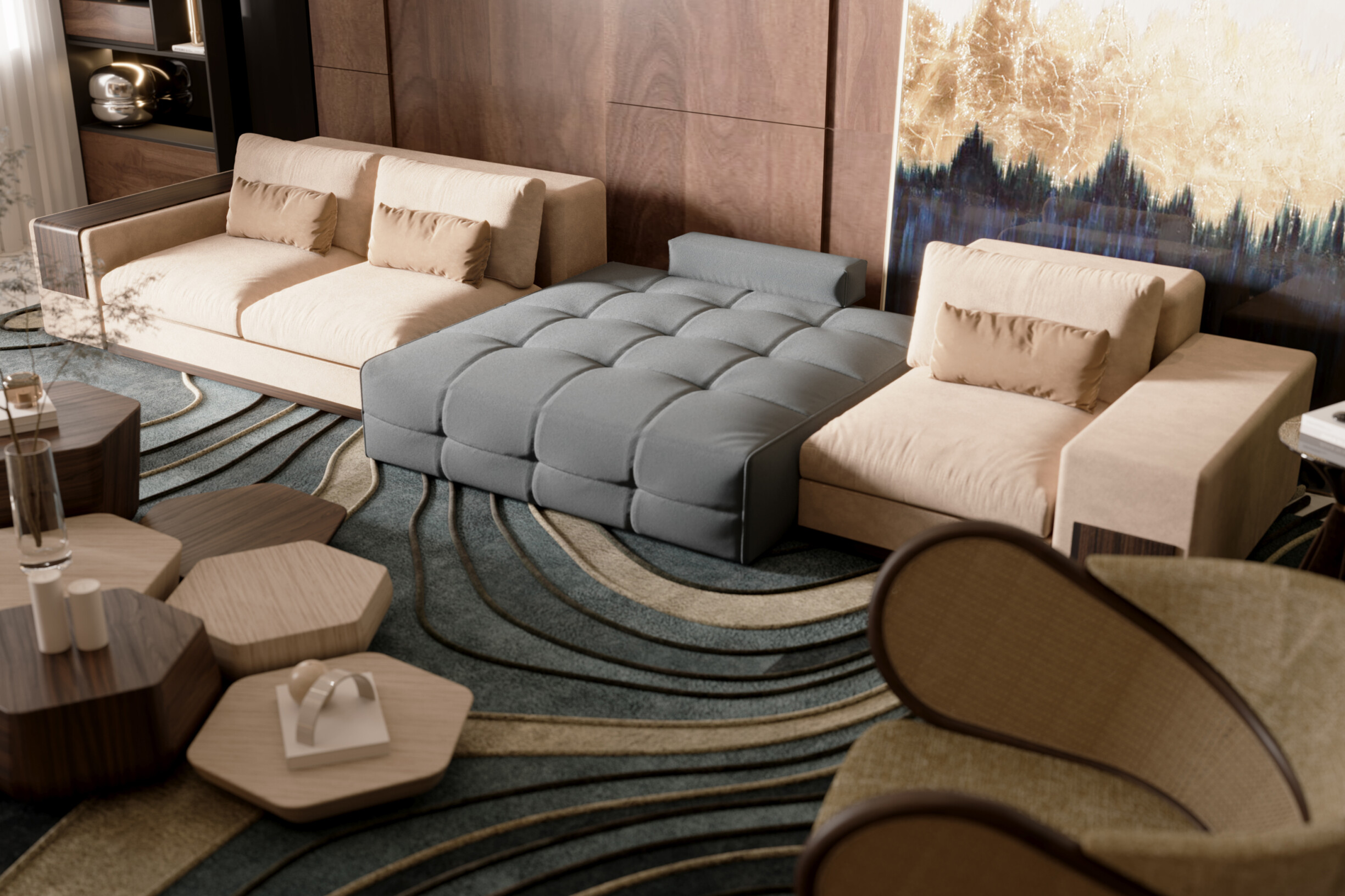
In interior design, symmetry and balance are two fundamental principles that guide the arrangement of elements within a space to promote harmony and functionality. Both concepts are closely linked but differ in their practical application: symmetry refers to the visual correspondence between objects or elements positioned reflectively, while balance concerns the proportional distribution of visual weight, which is not necessarily symmetrical.
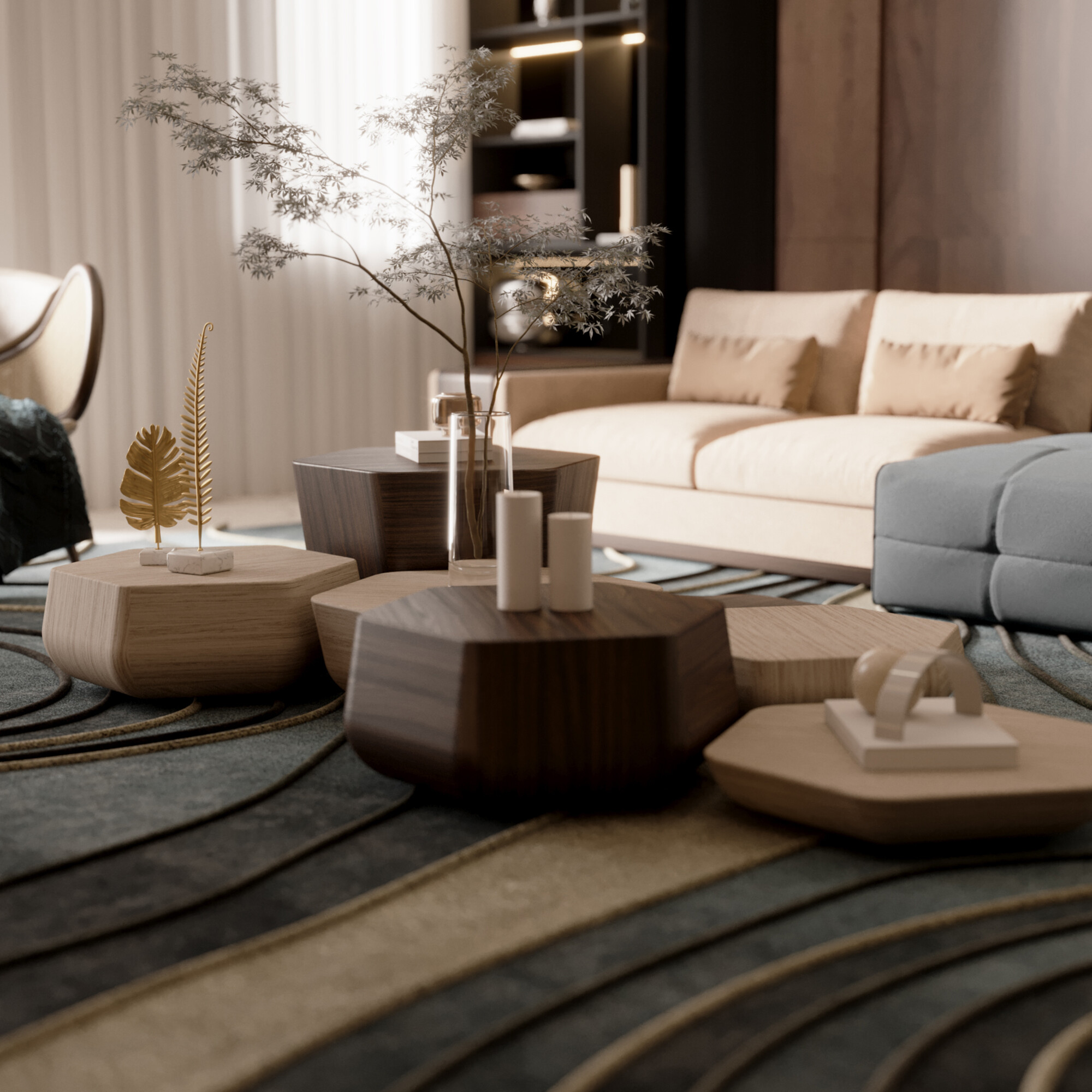
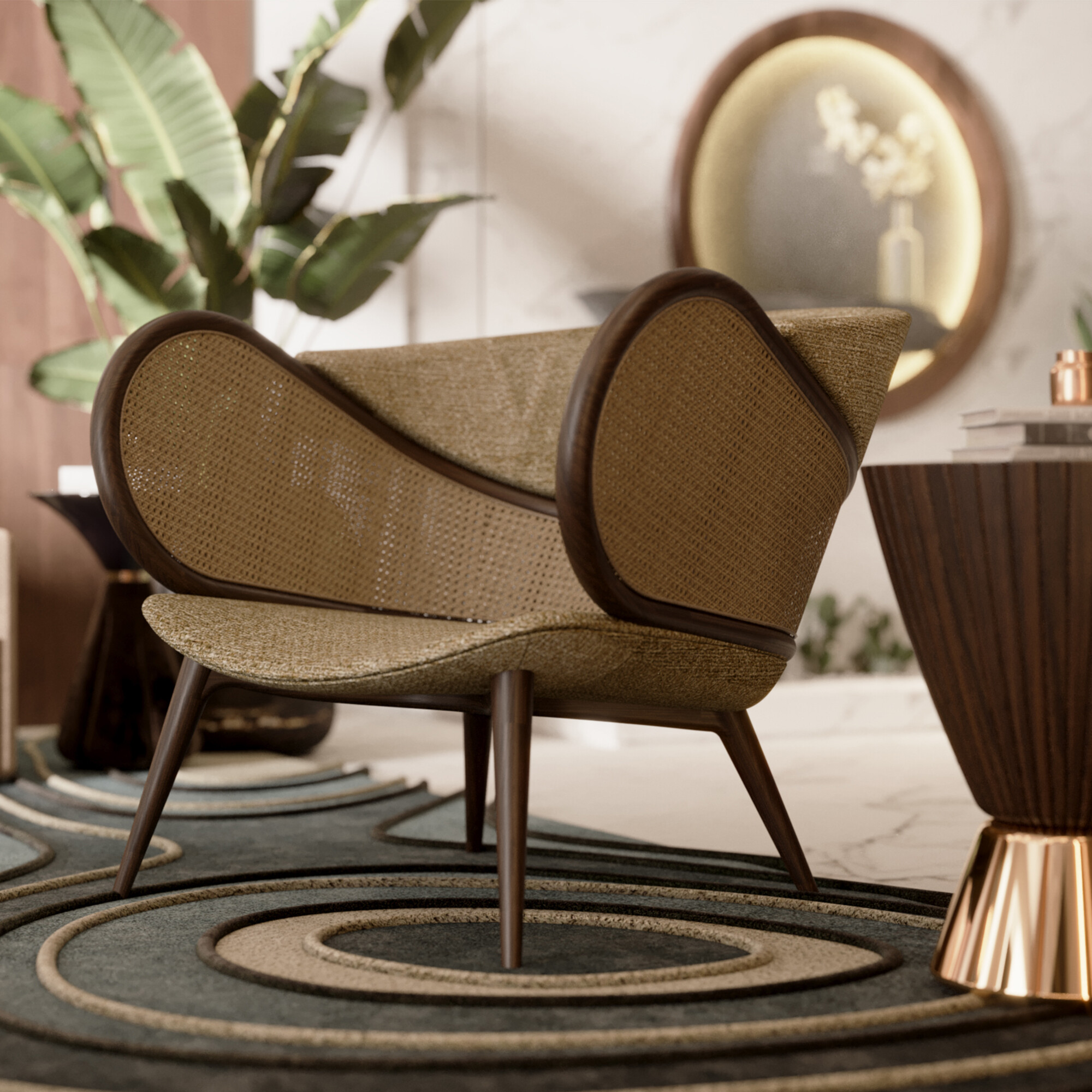
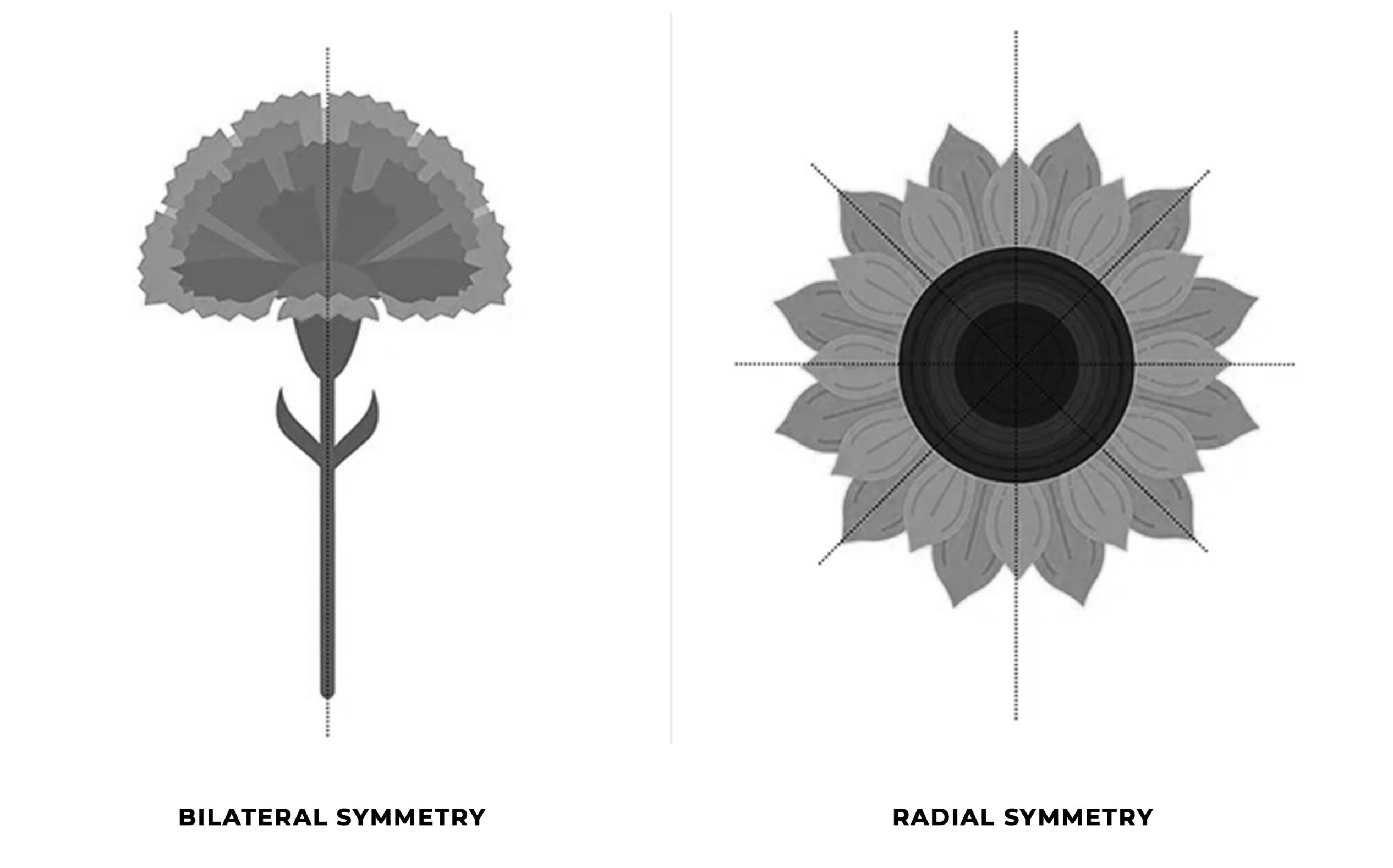
Symmetry is achieved when two sides of a space are identical or closely matched, creating a sense of order and stability. This type of composition is often associated with more formal or traditional settings. Symmetry can be applied in two ways:
Bilateral symmetry occurs when a space is divided into two parts, and both sides are mirrored. A simple example is placing two identical sofas facing each other in a living room.
Radial symmetry: this arrangement starts from a central point, with the elements radiating out from that center, such as a round table with chairs evenly distributed around it.
Conversely, balance is more flexible and can be achieved even when there is no perfect symmetry. It involves ensuring that objects and furniture in a space distribute visual weight proportionally. This means that no side of the room appears "heavier" or "lighter" than the other. Here, we can distinguish 3 types of balance:
Symmetrical balance is present when both sides of a space are the same or very similar, such as in bilateral symmetry.
Asymmetrical balance is achieved by combining different elements but with similar visual weight. For example, a large sofa can be balanced with two smaller chairs. This style is common in contemporary, minimalist, or informal rooms.
Radial balance occurs when elements are arranged around a central point, promoting a sense of circular harmony.

A balanced space reduces the feeling of chaos and conveys visual comfort, improving the functionality and emotional experience of those living there. The appropriate application of symmetry and balance is fundamental to any successful design project.
Symmetry plays a crucial role in how we perceive and interact with our surroundings. Studies in space psychology and design reveal that symmetry is not just an aesthetic issue but significantly influences our well-being and comfort in a space.
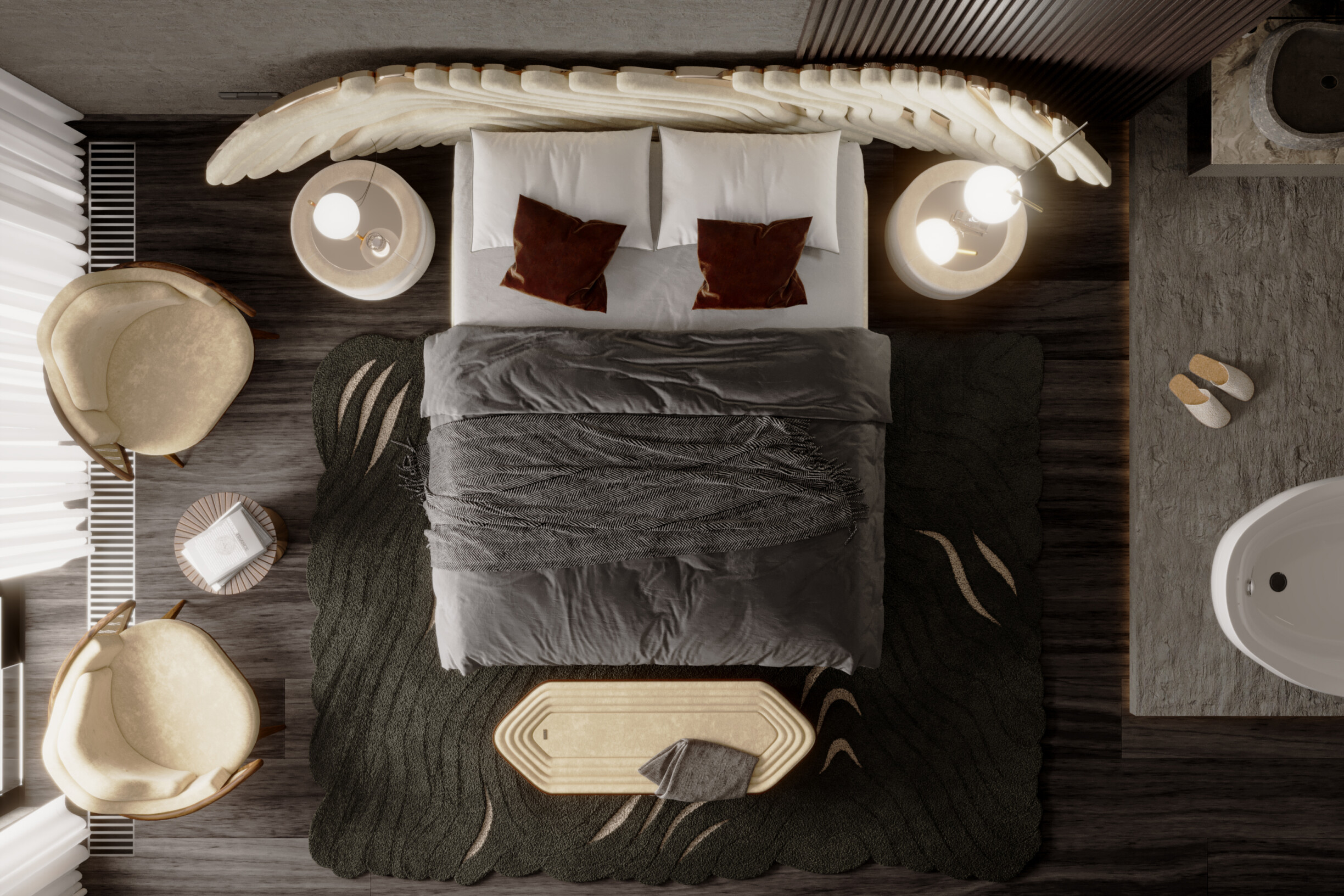
The human brain has an innate predisposition to recognize symmetrical patterns. Symmetrical spaces are processed more quickly, resulting in intense aesthetic appreciation. The order and predictability brought by symmetry provide comfort and security, reducing feelings of discomfort and anxiety.
Spaces with symmetrical arrangements promote positive emotional states. Symmetry is linked to order and, therefore, can reduce anxiety and increase well-being.
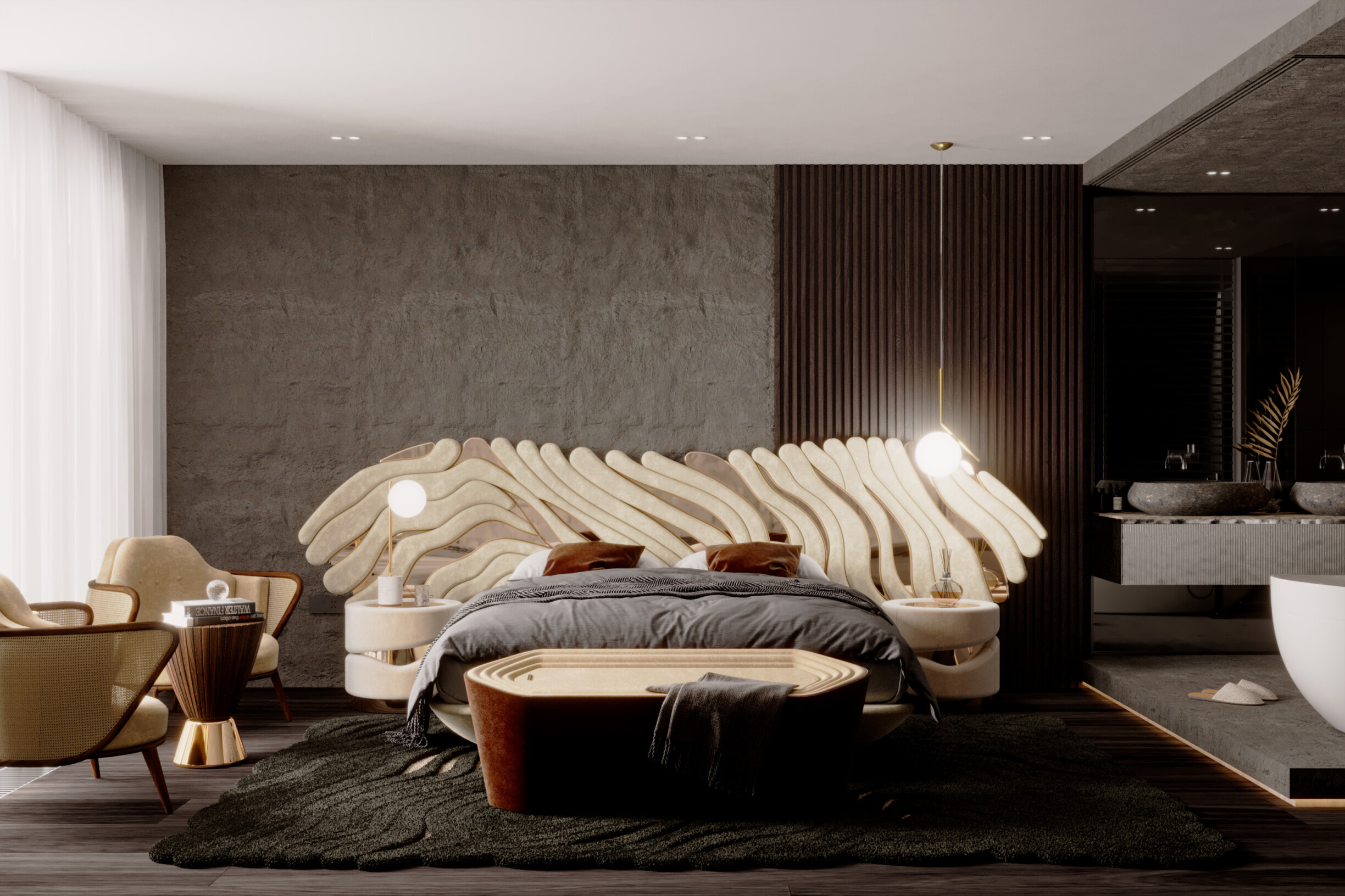
Applying principles of symmetry and balance in interior design can transform ordinary spaces into harmonious and visually pleasing areas. That’s why we have a set of tips for creating symmetry and balance in every room of a residential space.
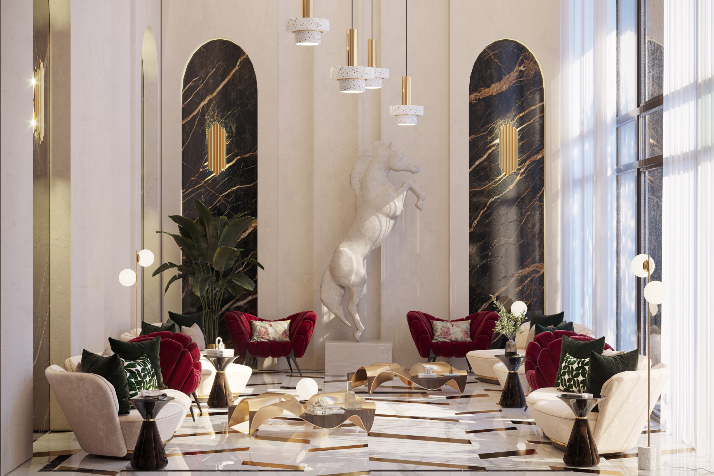
1. Living room
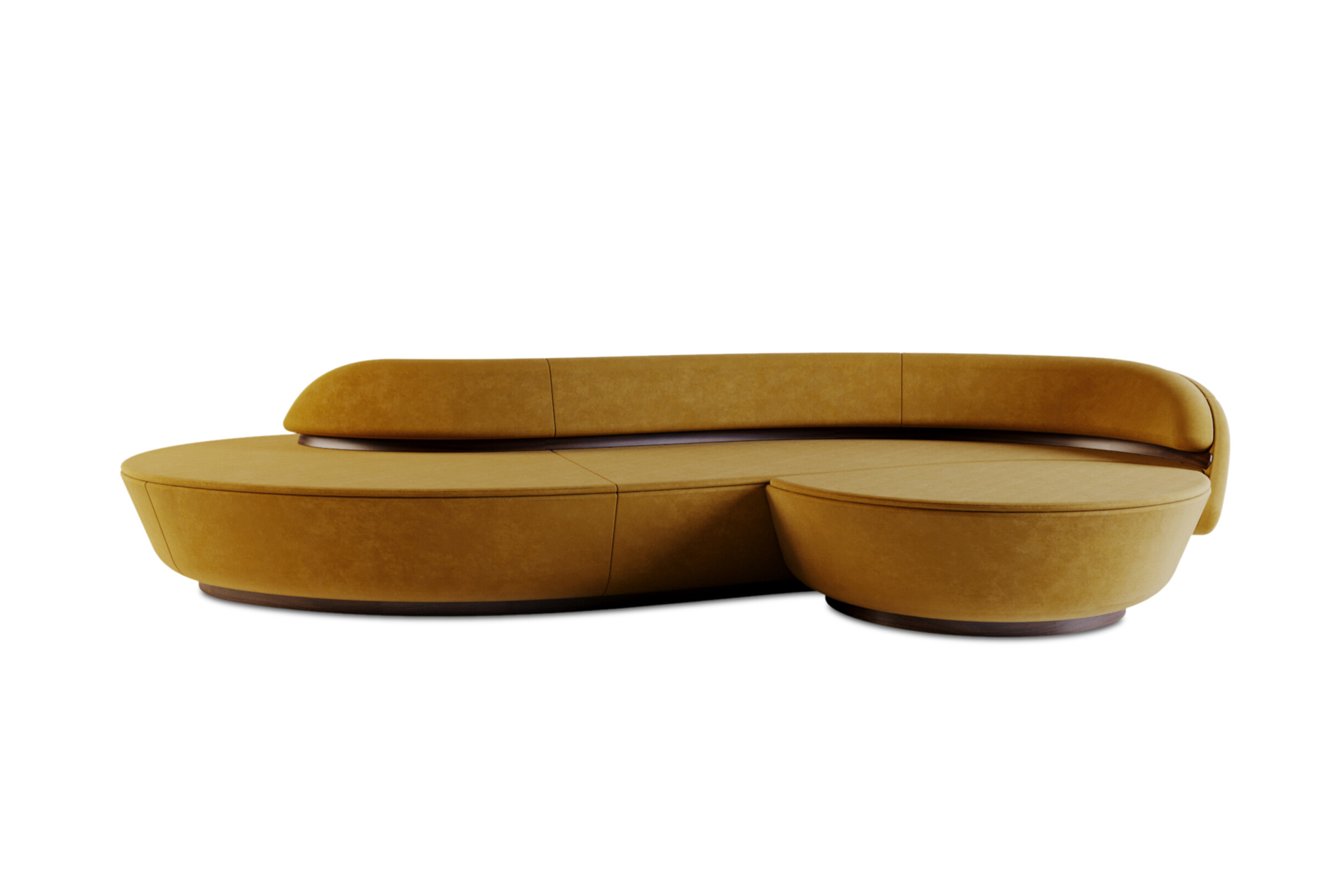
Symmetrical furniture: arranging sofas and chairs in pairs or in front of a coffee table can create a central focal point. For example, placing two Rusak sofas from ALMA de LUCE in opposite positions can create a more inviting conversation.
Decorative elements: hanging pictures in pairs or a symmetrical line along the wall can create a balanced look.
Lighting: lighting is vital, so pendant or table lamps should be positioned symmetrically.
2. Bedrooms
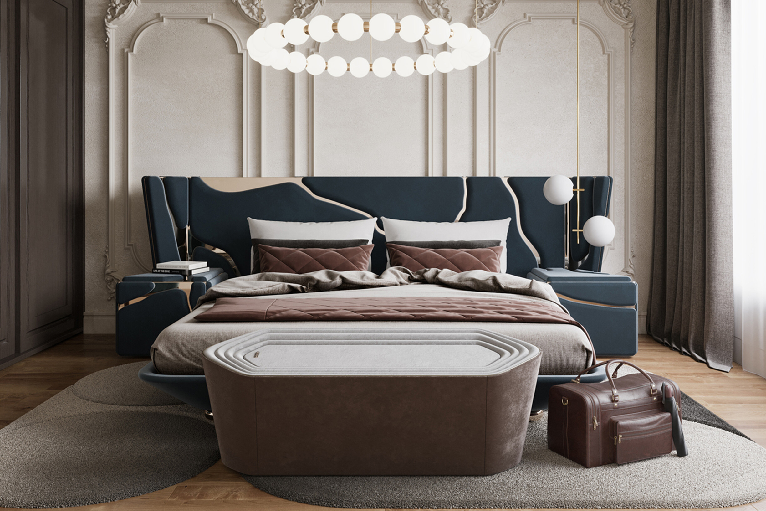
Beds and furniture: place the bed in the center of the main wall, like the Kintsukuroi bed from ALMA de LUCE, and position the Kintsukuroi nightstands on either side to create a balanced look.
Colours and textures: using symmetrical patterns in curtains or bedding can reinforce the feeling of balance in the space.
Mirrors: place mirrors on opposite sides of the bed or in symmetry with other decorative elements, which can expand the space and reflect light, making the room more airy. You can choose a mirror like Dom Sebastião from ALMA de LUCE to add presence to any space but also imbue it with a sense of grandeur and sophistication.
3. Home-office
Furniture layout: arranging tables and chairs symmetrically can make organizing things easier.
Wall decor: using shelves or pictures in symmetrical arrangements can create a professional and harmonious room. Placing shelves in pairs or using artwork of similar sizes helps to create visual balance.
Workspace: incorporating elements such as plants in symmetry with the workspace allows you to bring nature into your interior and provide a sense of well-being.
While symmetry and balance are essential concepts in interior design, improper application of these principles can harm the functionality and aesthetics of spaces. There are some common mistakes to avoid when applying symmetry and balance:
Excessive symmetry: creating an area where everything is perfectly symmetrical can result in a monotonous and personality-free space;
Neglecting visual balance: symmetry is not the only way to create balance. Focusing only on pairs and alignments can ignore the importance of distributing “visual weight” harmoniously;
Undervaluing functionality: focusing too much on symmetrical aesthetics can compromise the functionality of a space, making it less practical for those who use it;
Undervaluing the context of the space: applying symmetry rigidly to all types of areas can be a mistake, especially in spaces with irregular or open layouts;
Not varying the elements: the obsession with symmetry can result in a predictable and contrast less space, where everything seems too uniform;
Symmetry and balance are two fundamental pillars of interior design. They provide visual harmony and functionality in spaces. When applied sensitively and meeting the project's specific needs, these concepts create aesthetically pleasing and emotionally comfortable areas.
Want to see interior design projects where symmetry and balance achieve a perfect dance? Visit ALMA de LUCE's Pinterest and get inspired! We can also help you create exclusive and current projects that will win over your customers with this style!