Colours are fundamental in creating rooms that reflect styles, emotions, and contemporary trends. As we approach next year, inspiring insights into the colour palettes that will dominate spaces in 2024 are emerging.
Cultural trends, artistic movements, and the characteristics of society influence the five trend colours for 2024. Therefore, they promise to redefine and revitalize spaces in surprising ways.
Let's find out the colour forecast for 2024. We have gathered the five colours that will stand out as protagonists in interior design scenarios next year and suggest ways to use these tones in your projects.
The forecast is clear: 2024 will be a year of colour. Colour experts believe people will be more willing to take risks with colour, whether in fashion or everyday life. As such, the interior design reflects this trend, with bright oranges and reds, playful purples, earthy greens, and rich neutrals leading the trend colours for 2024.
The careful selection of colours in an interior design project is an art that goes far beyond aesthetics or personal taste, so knowing the trend shades is essential.
The trend colours represent a fusion between traditional tones and an innovative approach, mixing classic elements with modern touches to create an interesting visual balance.
Remember that colours convey sensations and feelings, so it is essential to realize that using colour psychology in interior design ensures that the room gives the feeling desired by the client.
In 2024, nature will strongly inspire us, incorporating earthy and green tones that evoke natural landscapes. They reflect the growing concern for well-being and comfort in interior spaces. These tones promote serenity and a feeling of refuge.
The focus on stronger tones, such as red and purple, offers the opportunity to express the individuality and personality of the occupants of the spaces. They are the opportunity to create unique atmospheres and reflect lifestyles.
The artful use of colour can elevate a design from ordinary to extraordinary, evoking emotions, setting moods, and creating a captivating visual symphony. You should keep this idea in mind when opting for trend colours.
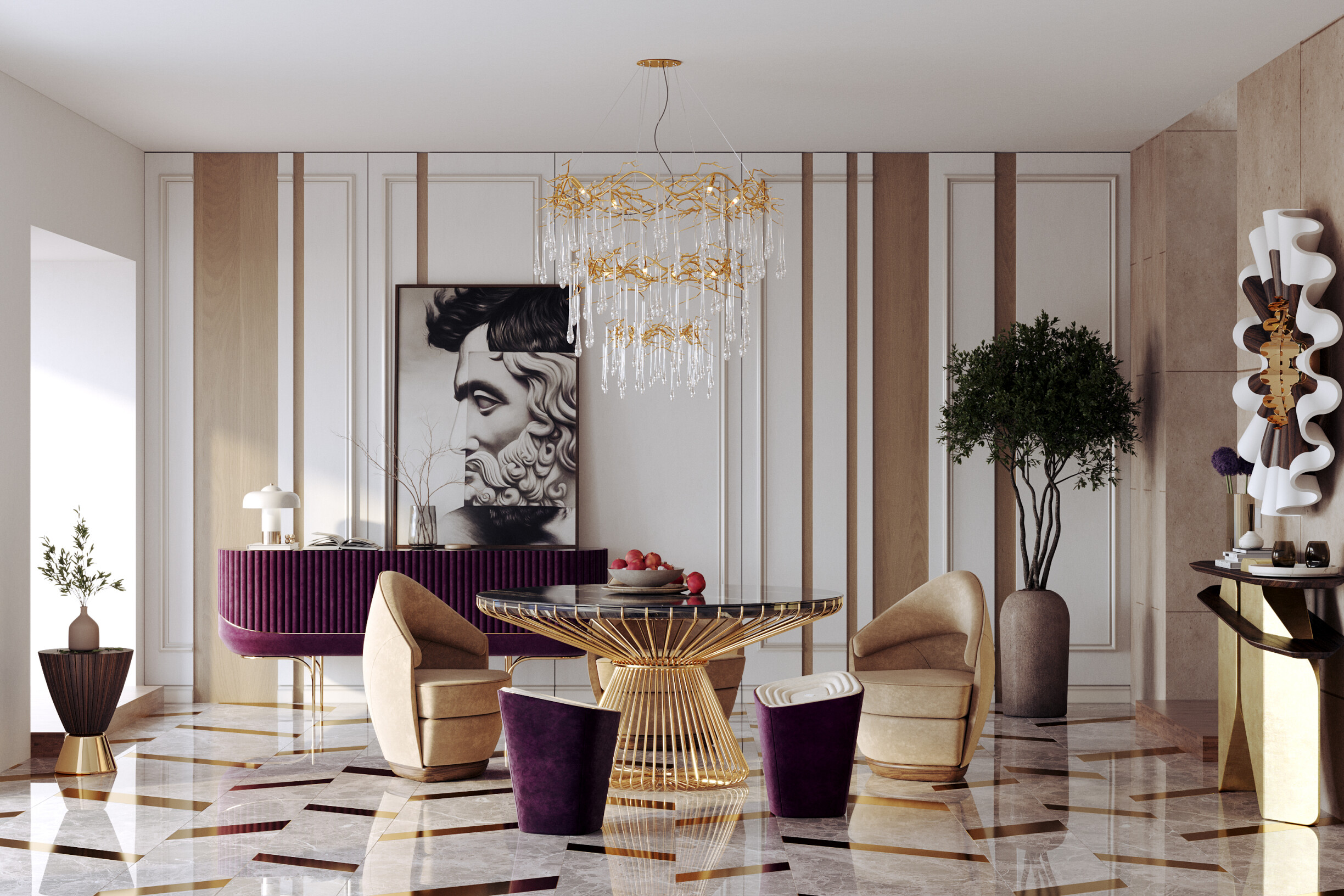
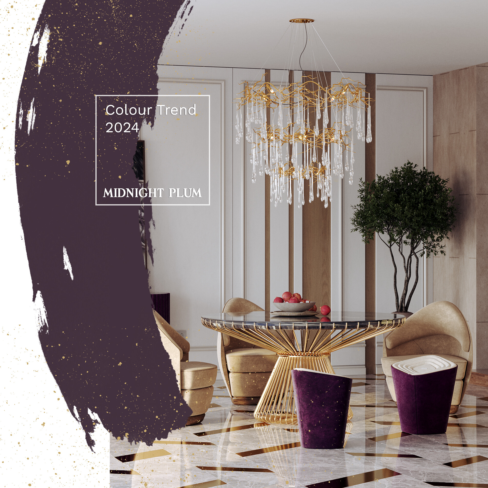
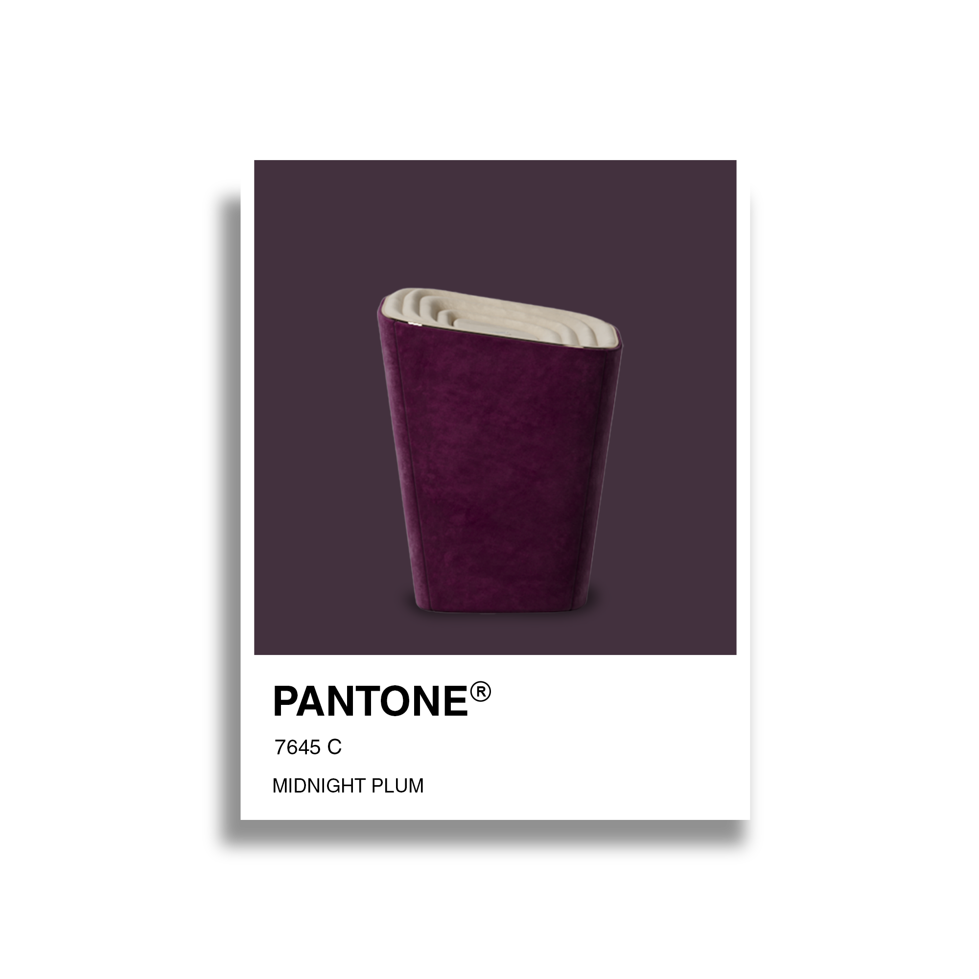
When one-day finishes and another begins, inky blues deepen into rich purples, filling the night sky with a sense of wonder and possibility. That's the power of Midnight Plum. This colour emerges as a captivating and transcendent trend colour, defying conventions
Midnight Plum is warm and vibrant, somewhere between purple and magenta. It's regal and classical, which can be a bold and elegant choice in interior design. Also, historically, plum was a colour that was often reserved for royalty and the aristocracy. In many cultures, rich and deep colours like plum were expensive to produce, thus becoming associated with wealth and luxury.
Plum looks perfect with olive green, marigold yellow, dark beige, and grey.
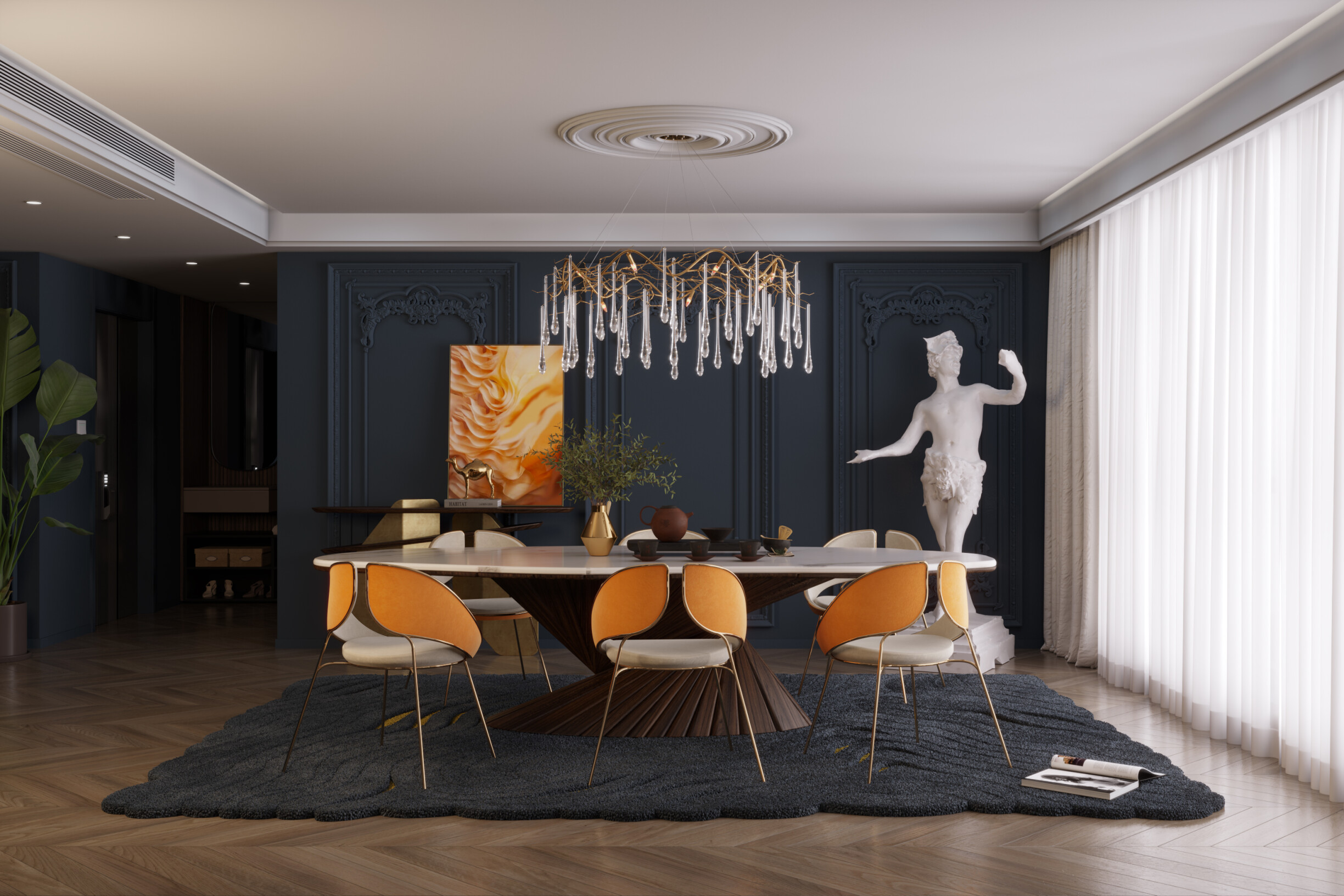
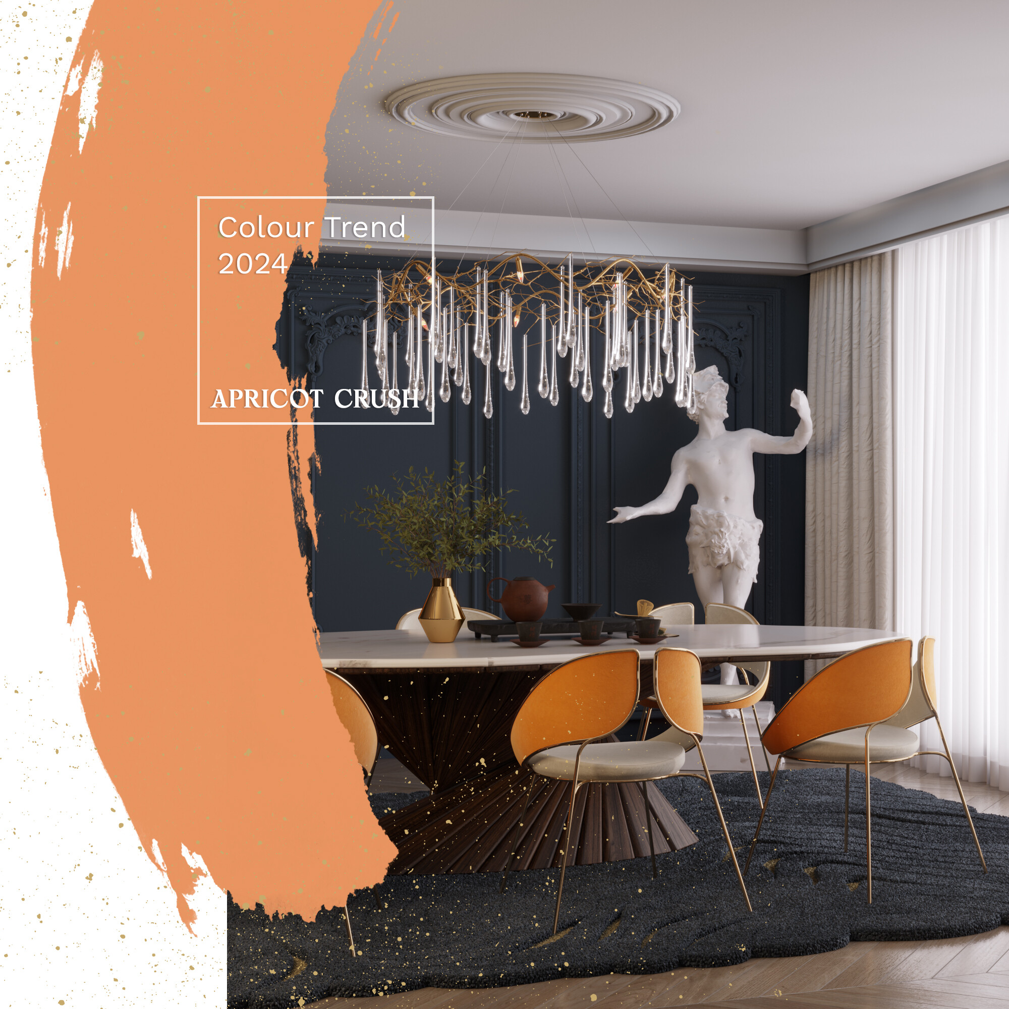
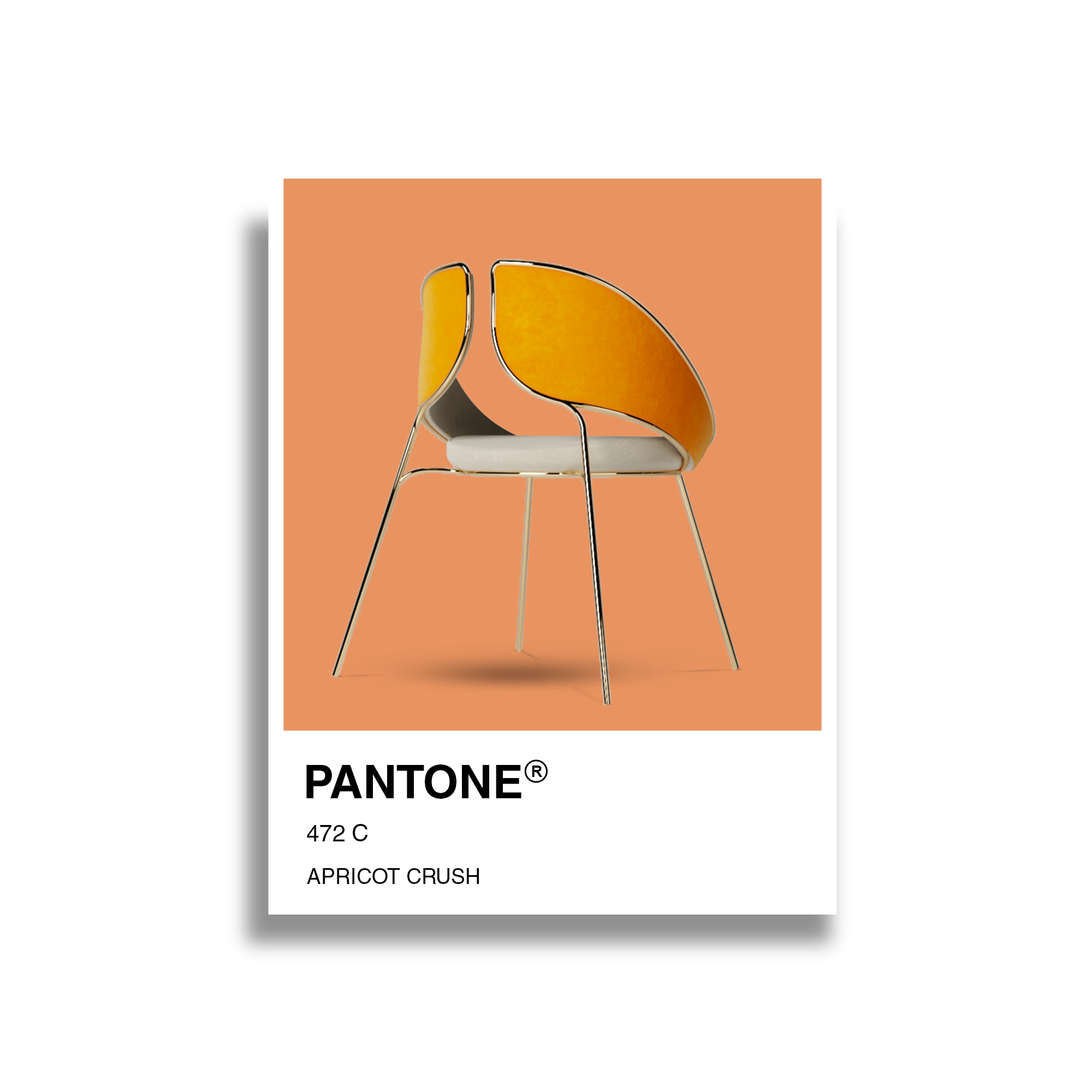
WGSN and Colouro presented the colour that will reign in industries such as marketing, advertising, fashion, beauty and cosmetics, and much more, including interior design: Apricot Crush. This signifies the importance of orange as a versatile, transseasonal shade.
Apricot Crush is a stimulating, refreshing, and energetic colour. This balancing bright is an activating vitamin tone that embodies a complete spectrum approach to health and wellbeing. Encompassing the natural vitamin and antioxidant-rich benefits of apricots and oranges, it also draws from the beauty found in nature.
It is one of the most popular colours for both indoor and outdoor areas, guaranteeing a welcoming light to the home. The softness and sun-faded tone pair perfectly with neutrals.
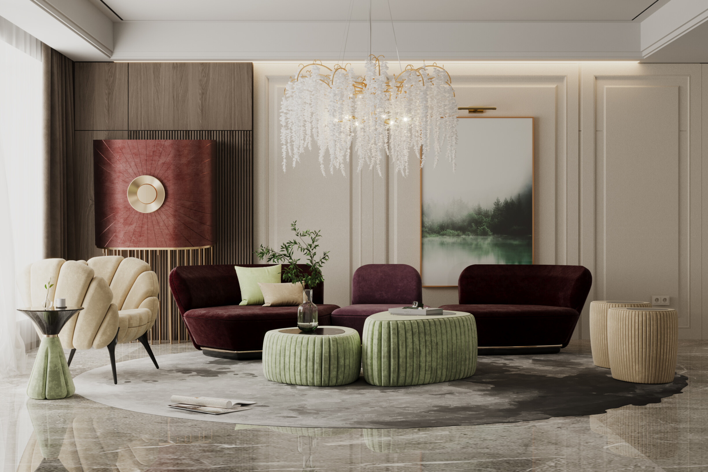
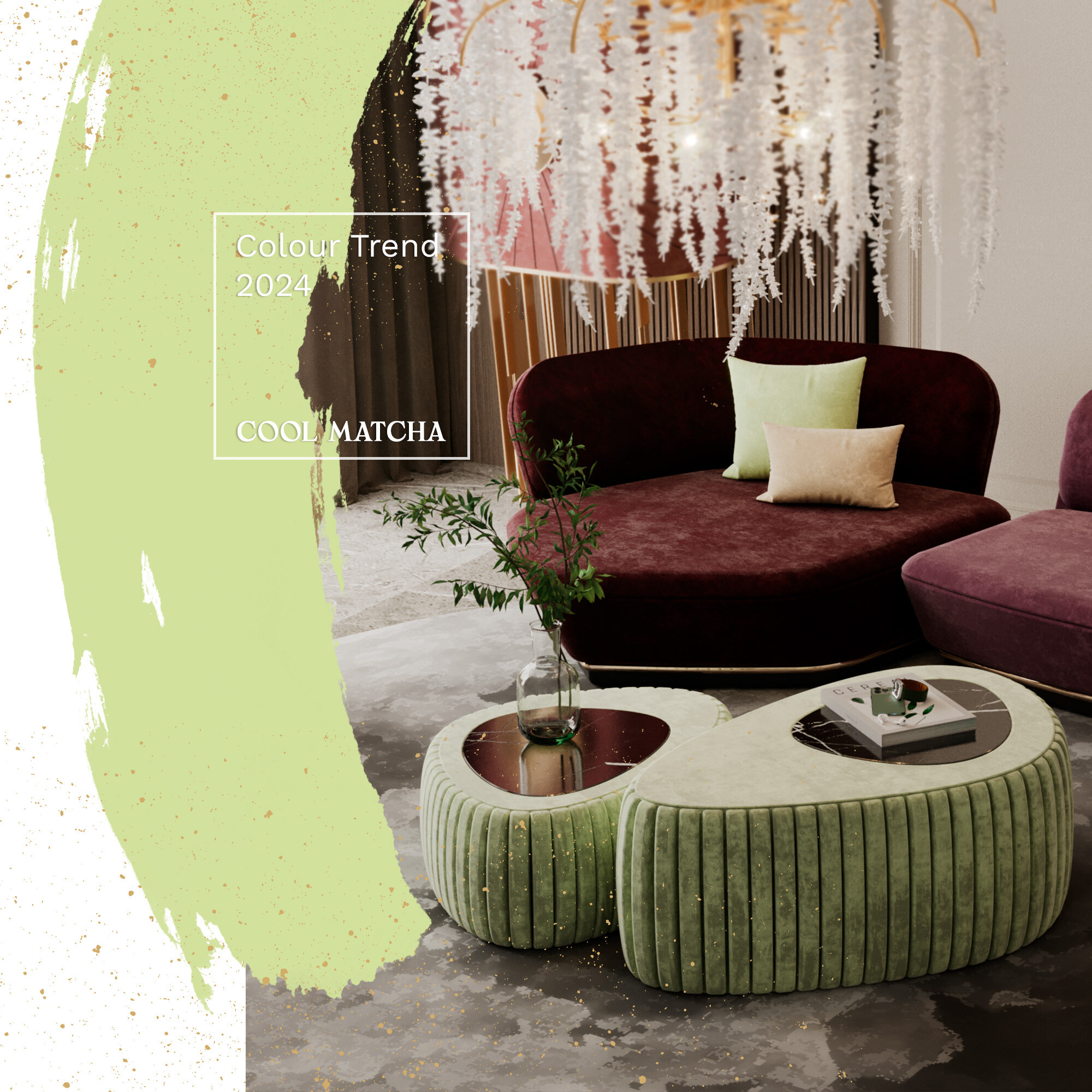
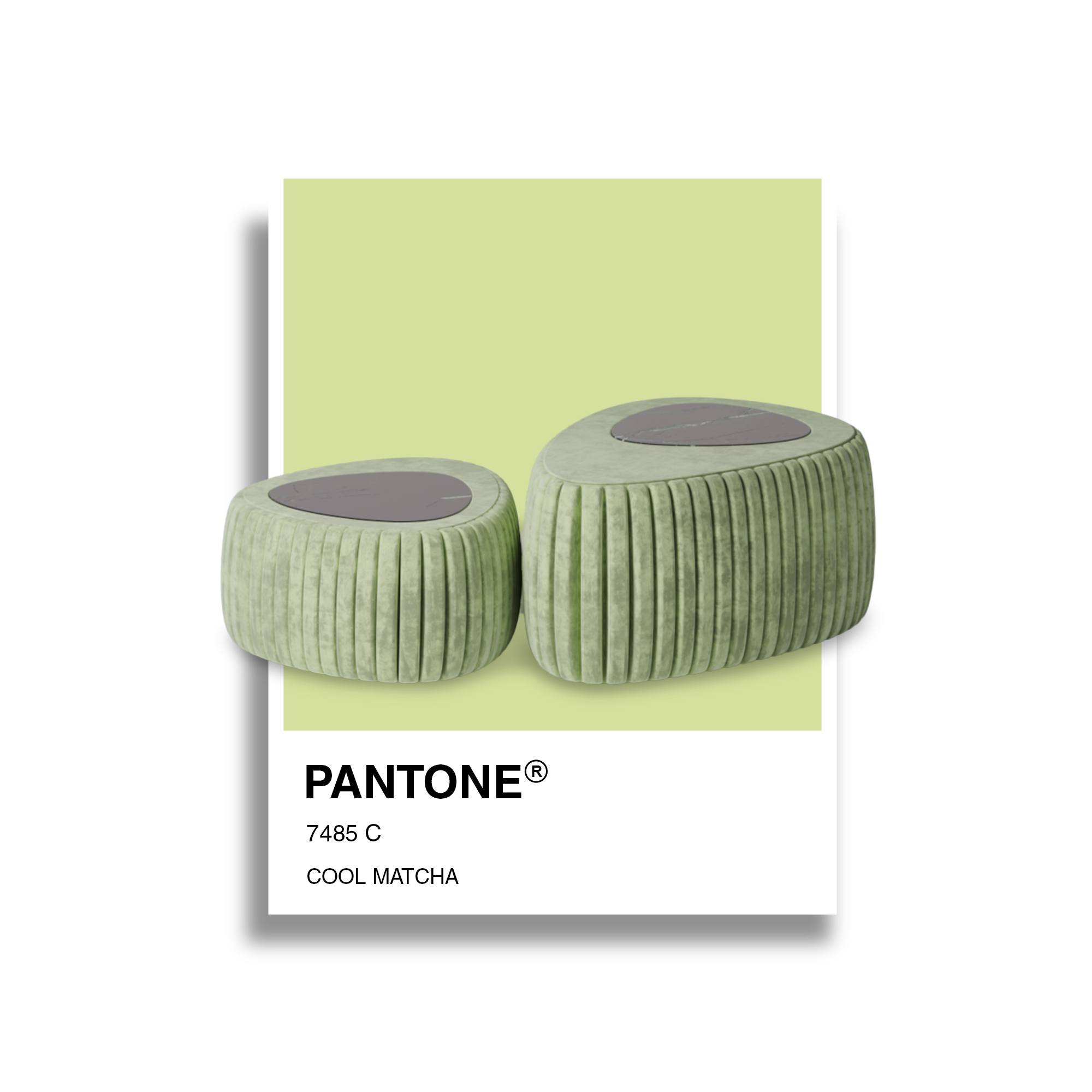
Green, significantly darker shades, such as emerald green, have been popular. Next year, Cool Matcha will the star. The nature-inspired hues evoke a calming quality that most people find comforting.
In 2024, this classic colour is expected to be modernized with more profound and sophisticated tones, providing a feeling of luxury and elegance to spaces.
Modern greens are perfect for adding a touch of colour to the decor without fearing leaving the space too colourful, for example, through a piece like the modular sofa Mies from ALMA de LUCE or Longjing rug.
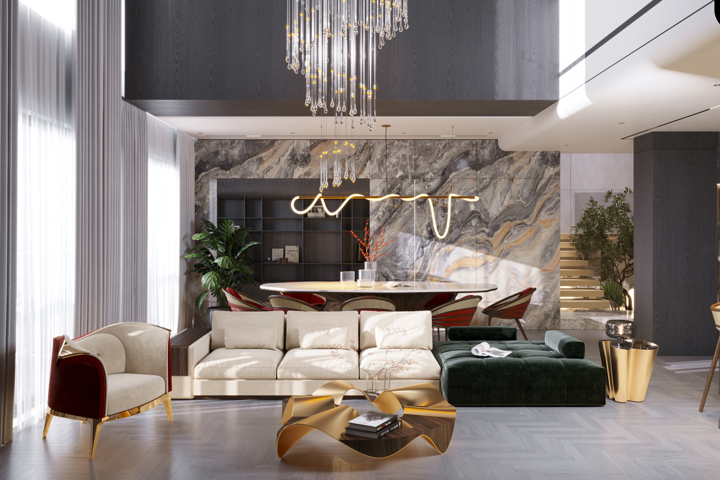
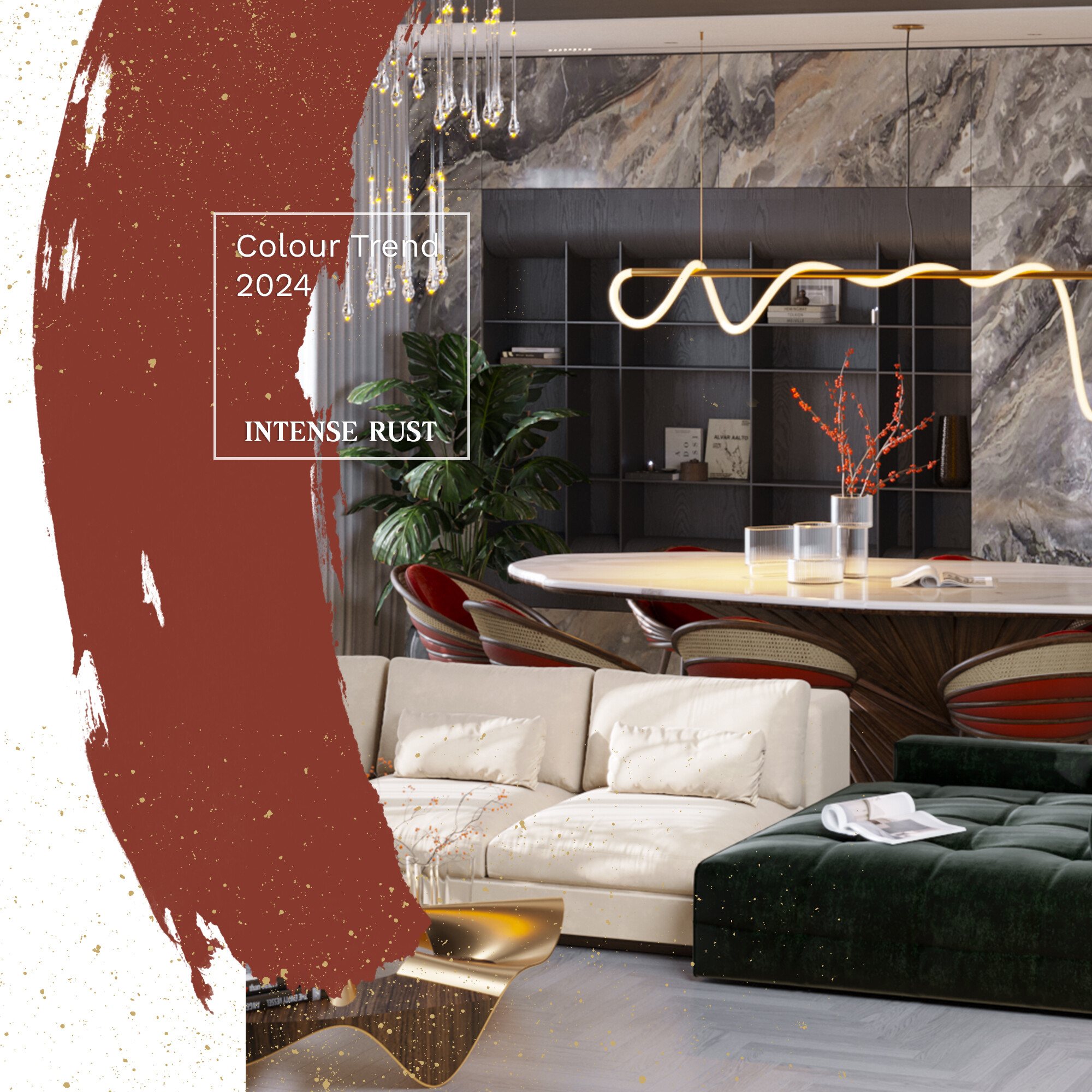
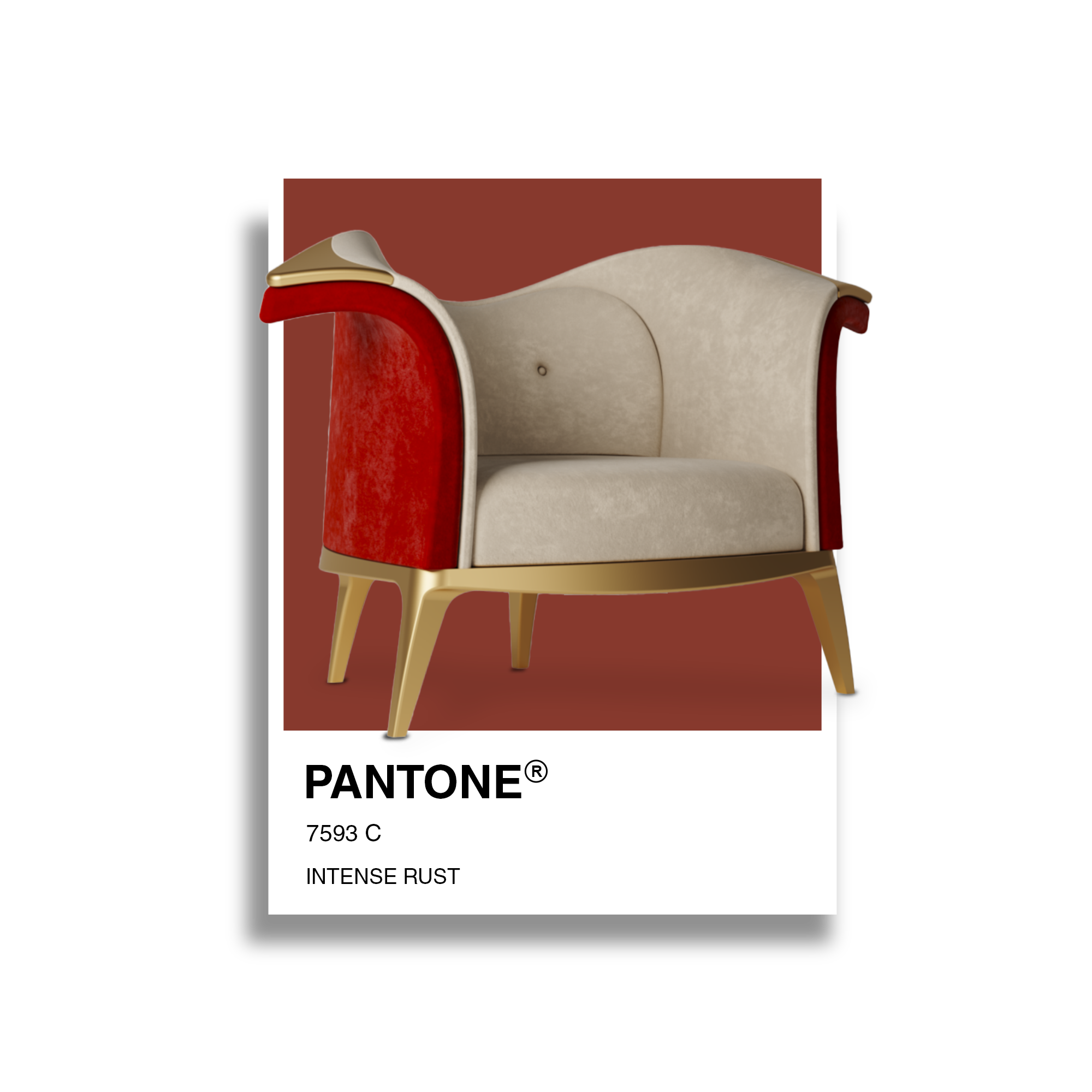
Intense Rust's warm and rich shade is a trans-seasonal brown that evokes feelings of stability. Balancing luxury with a raw earthy edge, this colour is reminiscent of soil and earth, full of warmth and calm textures
The shade is inspired by consumers who value greater sustainability and stability. Intense Rust communicates authenticity, and understated luxury and promotes the return of classic design.
The tone is timeless, giving a feeling of stability. Intense Rust is also a colour in which the luxury of sobriety is in perfect harmony with the rustic nature represented by the memory of ancestral soil, reliable and therefore relaxing.
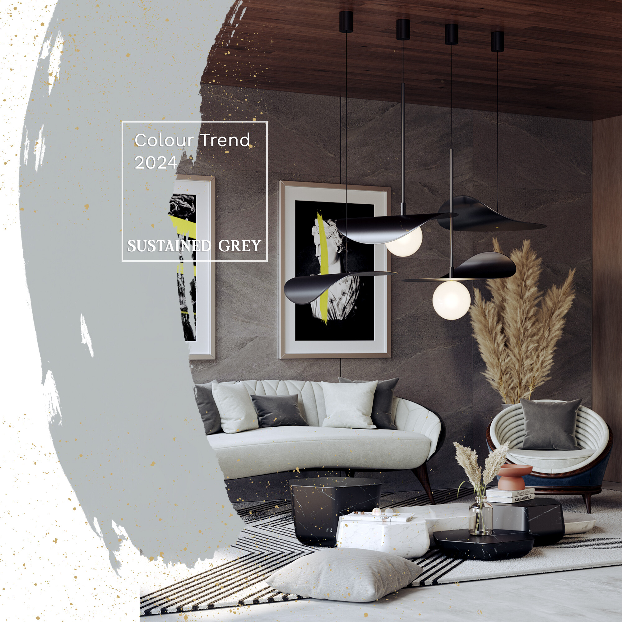
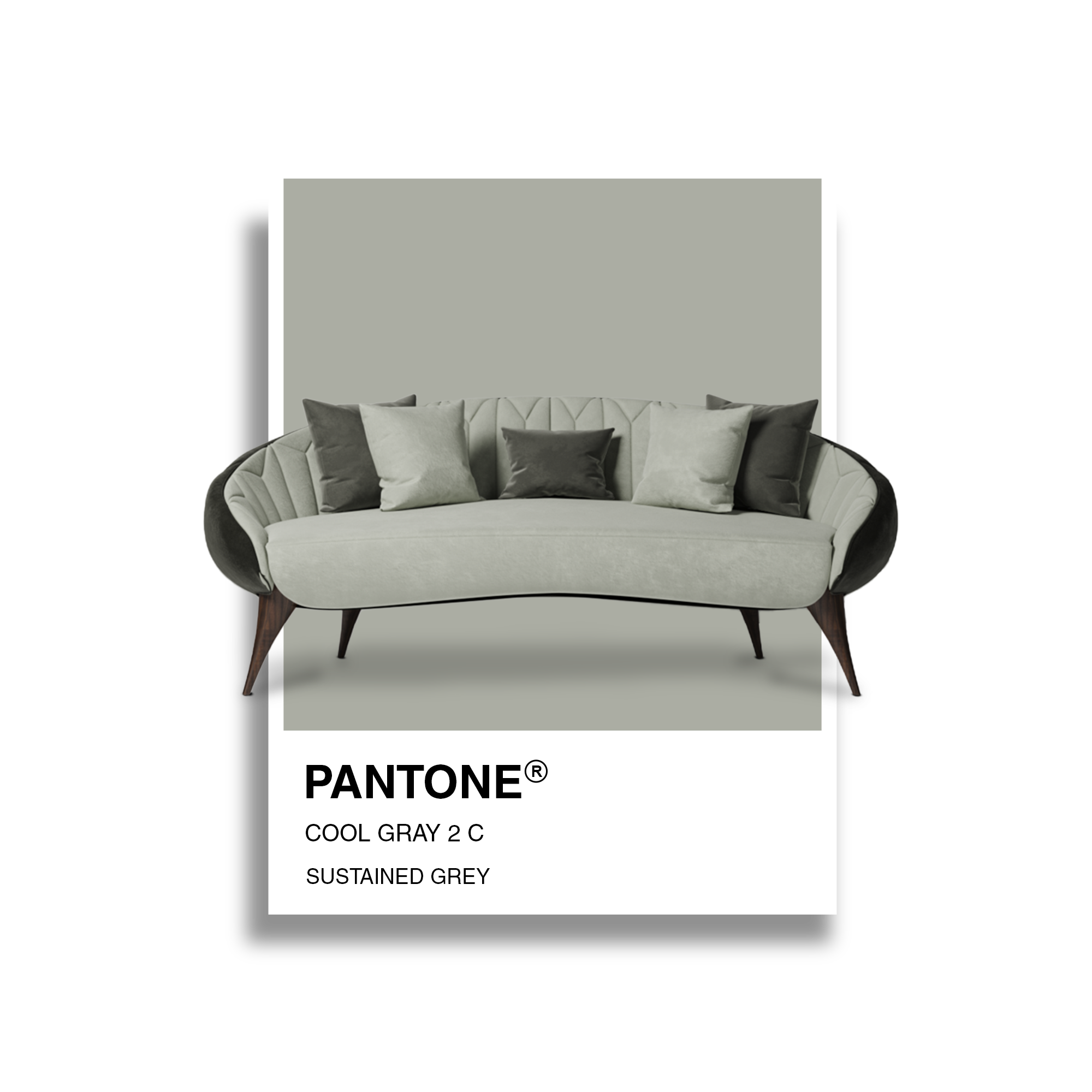
This colour has sustainability in its name. It has the versatility of evergreen and neutral colours that can promote a slowdown in consumption, in line with the collective desire to have "just enough" and to enable recycling and reuse. It is a colour that evokes a feeling of confidence.
Sustained Grey aligns with consumer influences such as a focus on well-being, creativity, the environment, and technology. Also, it affirms the continued value of neutral colours and environmentally friendly colour schemes.
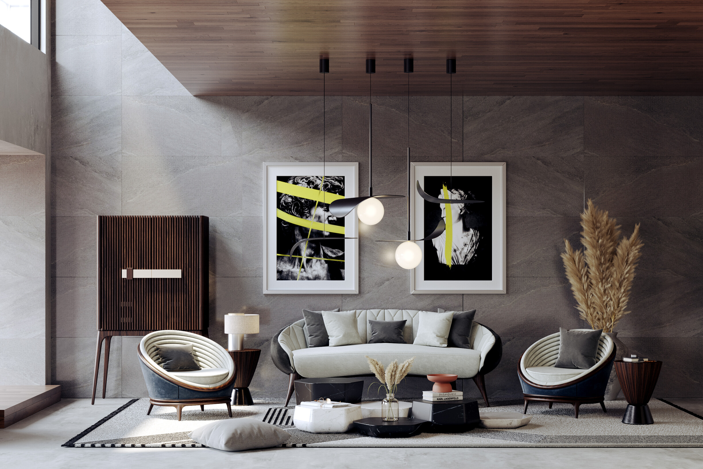
How do you effectively incorporate trend colours for 2024 into interior design projects? Adding a contemporary touch without compromising the functionality and aesthetics of the space. Therefore, follow our 3 tips:
1. Use trend colours in strategic details
The trick is introducing them in strategic details, especially when discussing more striking colours, like red, green, or grey. Cushions, blankets, or rugs in trendy colours will make a difference in the decor.
2. Balance is the key
Combining trend colours with neutral tones creates a visual balance. For example, if you're using a vibrant colour on a sofa, balance it with neutral tones like white, grey, or beige to avoid the room looking overly saturated. This allows the trendy colour to stand out without completely dominating the space.
3. Explore texture and materiality
In addition to incorporating the trend colour, consider exploring exciting textures and materials that complement that colour. Fabrics, wall coverings, furniture, or decorative elements in different textures can enhance the visual sensation of the space.
Choosing textured elements in an interior decoration project is crucial to creating an attractive and comfortable area.
Are you inspired to use these 5 colours in your interior design projects? You can create a moodboard or get inspiration to create cozy, sophisticated, and elegant spaces.
Did you like our tips? Stay tuned to our blog for more information and curiosities from the universe of architecture, interiors, and design! We are attentive to the latest news in the sector to give you all the necessary information. You can also follow us on Instagram, Facebook, and Pinterest for all updates.