"Color is the least expensive thing to put in a house."
Ruthie Sommers, designer
Have you ever imagined what interior decoration and design would be like without color? Interior designer Ruthie Sommers affirms this but without demeaning and devaluation of color. On the contrary. Color is a universal language. It's a powerful tool. That's why this element is present in all sectors and significantly impacts purchasing decisions.
If 2022 was all about calming tones, we expect 2023 to be the return of warm and refreshing colors. Its importance is such that Pantone defines the year's color every year, and WGSN, in partnership with Coloro, predicts the trend colors for different industrial sectors, including interior design. Earth tones, warm neutrals, pink tones, dark accents, and pops of color are what you can expect from the five colors that will be trending in 2023.
These colors reflect the different journeys and facets of life, where, after a challenging period, people will adjust their lifestyle and focus on building a vision for the future—the colors they are attracted to reflect this trend.
Are you going to renovate your house or your store? Or create an interior design project? Do you know where to start? The color palette is crucial and should be defined early on. Here are all the tips on choosing the color palette for your project.
WGSN is considered the global authority on consumer trends and design. In partnership with Coloro, an international specialist in the color, textile, fashion, and creative industries, they analyze and investigate the colors adopted each year.
The process starts with a survey carried out by both companies on several continents, covering different industries such as fashion, lifestyle, interiors, technology, and beauty. This research in the Americas, Africa, Asia, and Europe results in a global view of the forces creating trends. Subsequently, each critical forecast color is rigorously tested to ensure reachability in all areas. The result is, as a rule, five colors that will be successful.
In interior design, the five most popular colors for 2023 reflect a new lifestyle and consumer motivational forces such as healing, discovery, transformation, simplicity, and pleasure.
The five tones capture the consumer's evolving behaviors and are sensitive to changing emotional states. For example, vibrant and energizing colors reflect the return of confidence in connection with discovery and imagination. In contrast, healing and stabilizing tones will lead people to calm and rebalance the body and mind.
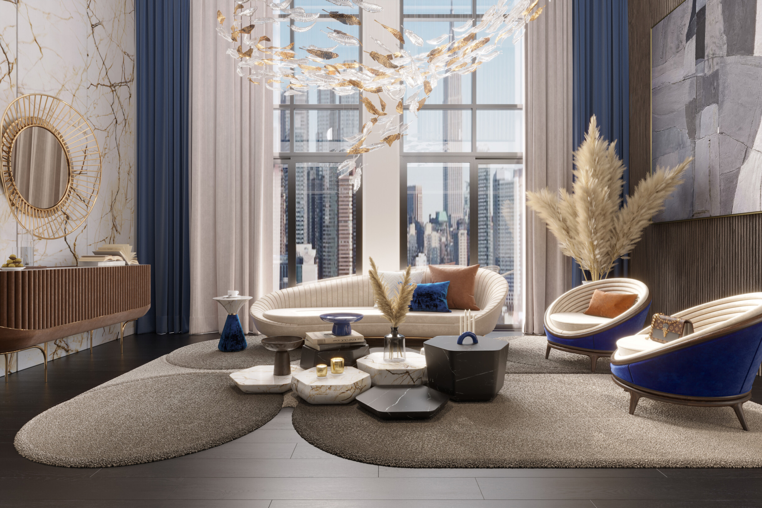
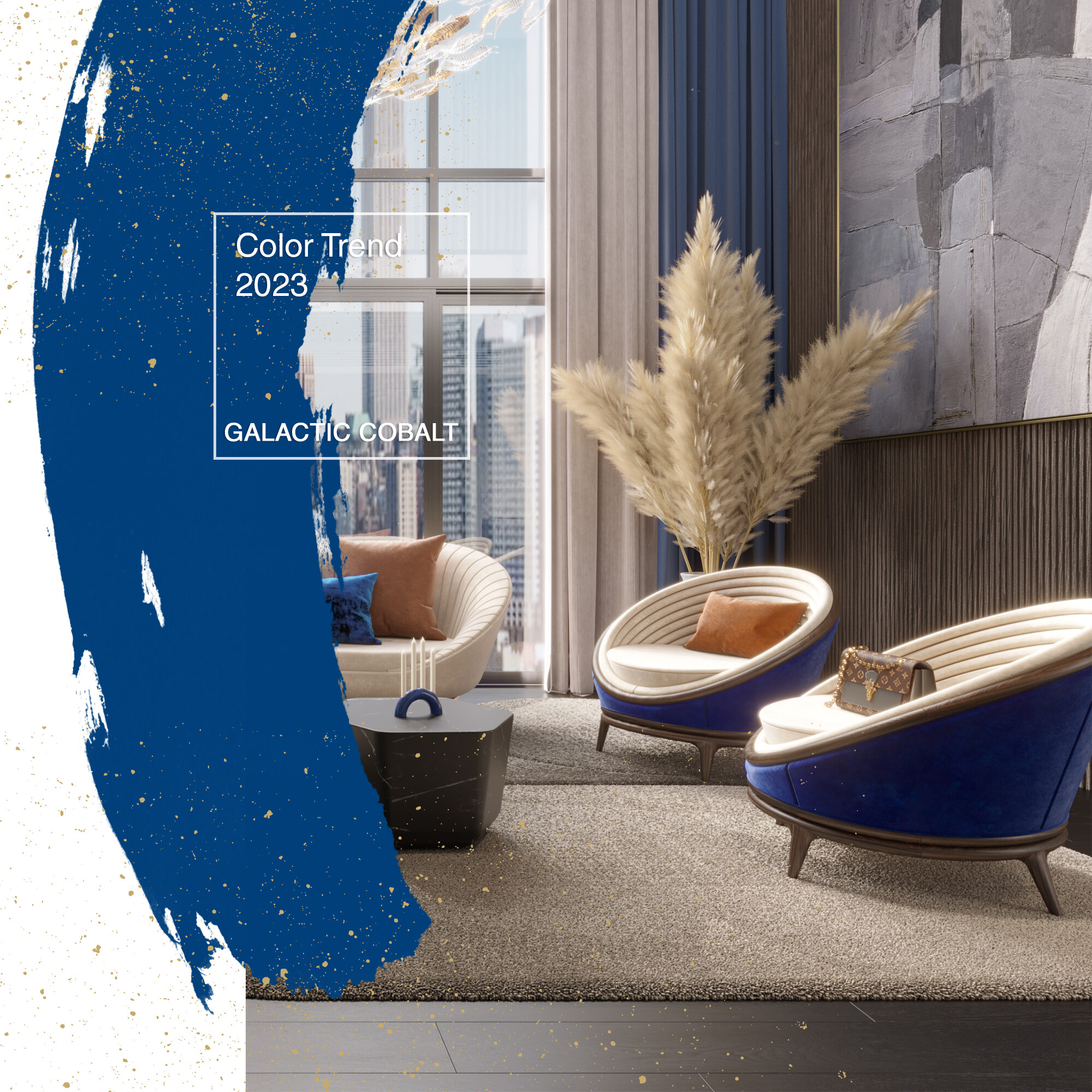
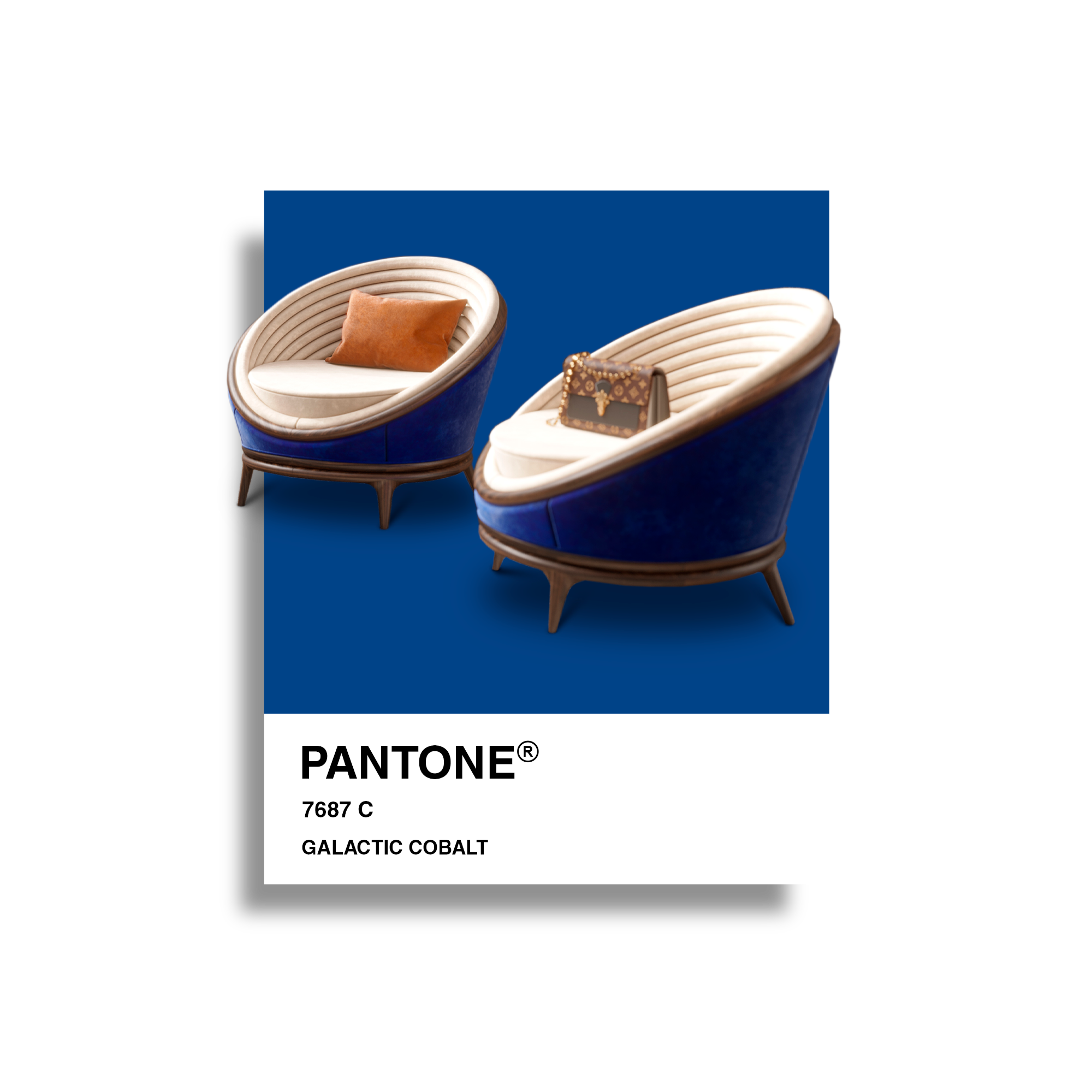
We live in a modern space age. An era where the metaverse is a reality. Influenced by these two characteristics comes Galactic Cobalt, a hyper-bright blue tone that refers to new technologies, innovation, and virtual reality. This intense, versatile, and technological color projects a feeling of "escapism and extended reality".
Although it is a very saturated color, it is considered a calming and versatile color associated with the sky. Therefore, this intense, digital blue works perfectly in business environments or a home office. Its strength can be applied both as the main focus of the design, as in coverings or decorative objects that highlight the environment and give it personality.
One of our main tips is to combine this calm tone with white, grey, or beige. Also, it complements perfectly with wood.
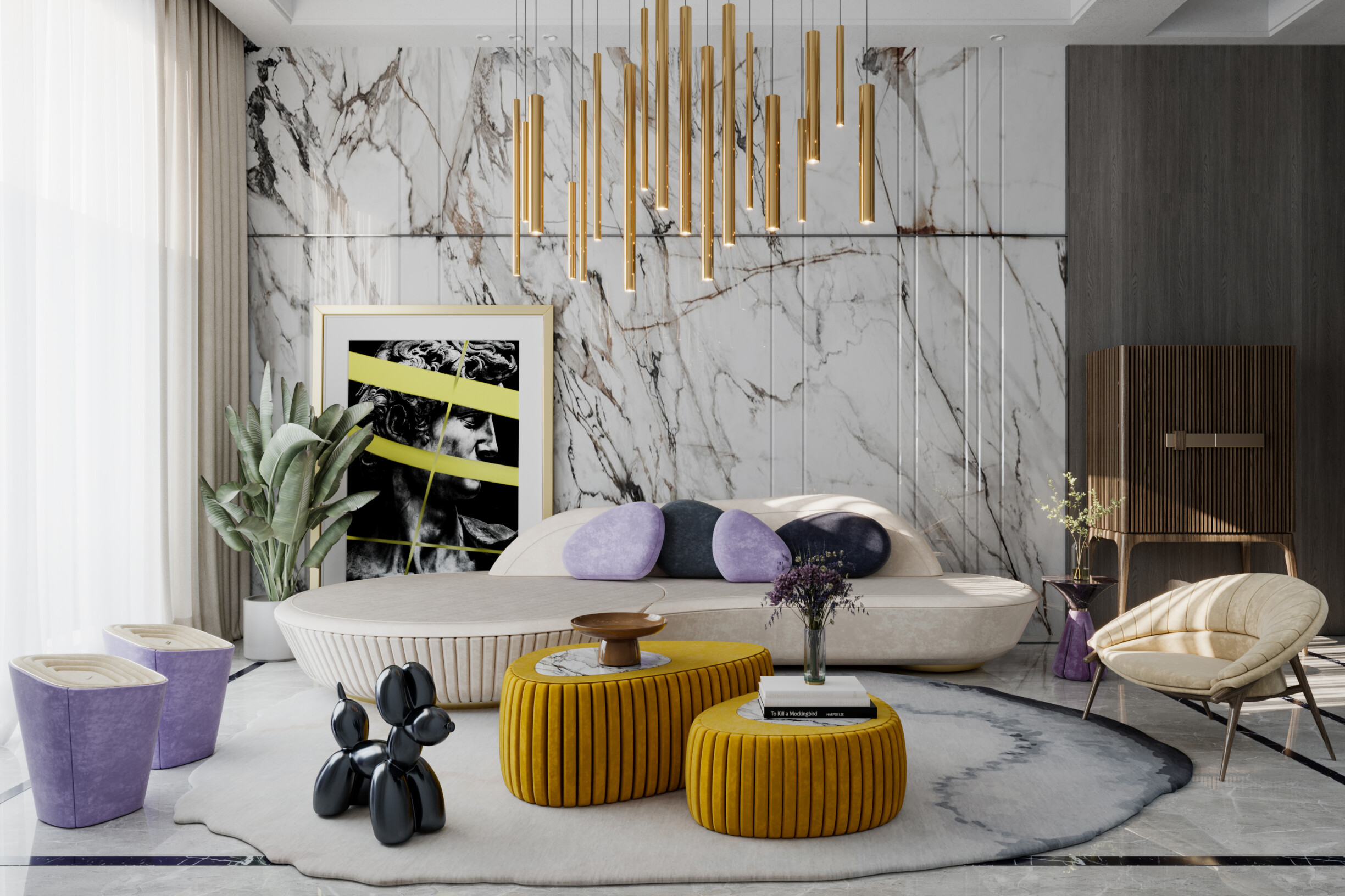
"Purple is a color we've rarely seen used in bedroom designs, but we are expecting more of. Color psychology has proven purples are romantic, peaceful, and luxurious. The buzz surrounding Digital Lavender as the 2023 Color of the Year has only reassured us that purple is a definite for 2023 design, " stated one of Design West's designers, a North American interior design company with more than 40 years of experience in the sector.
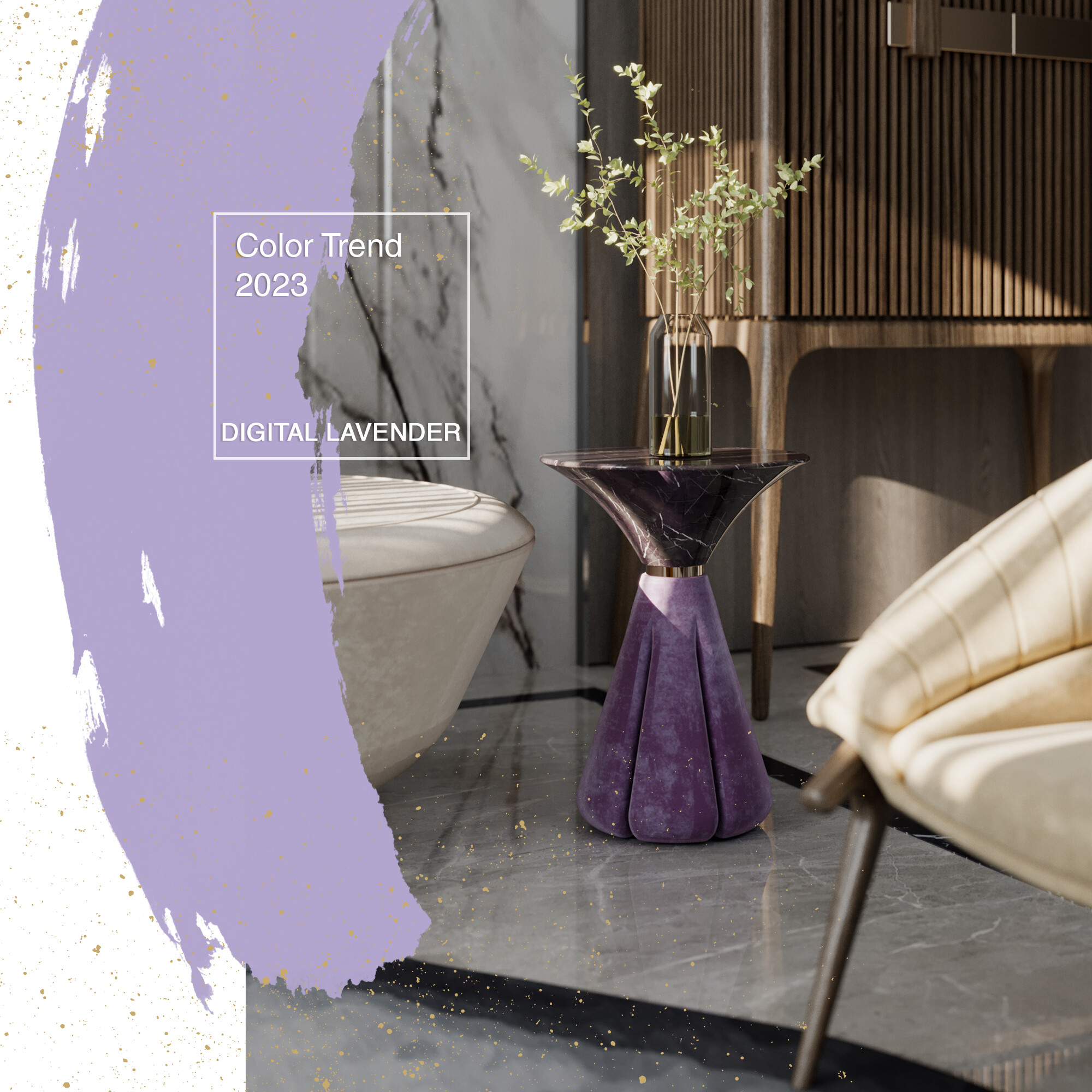
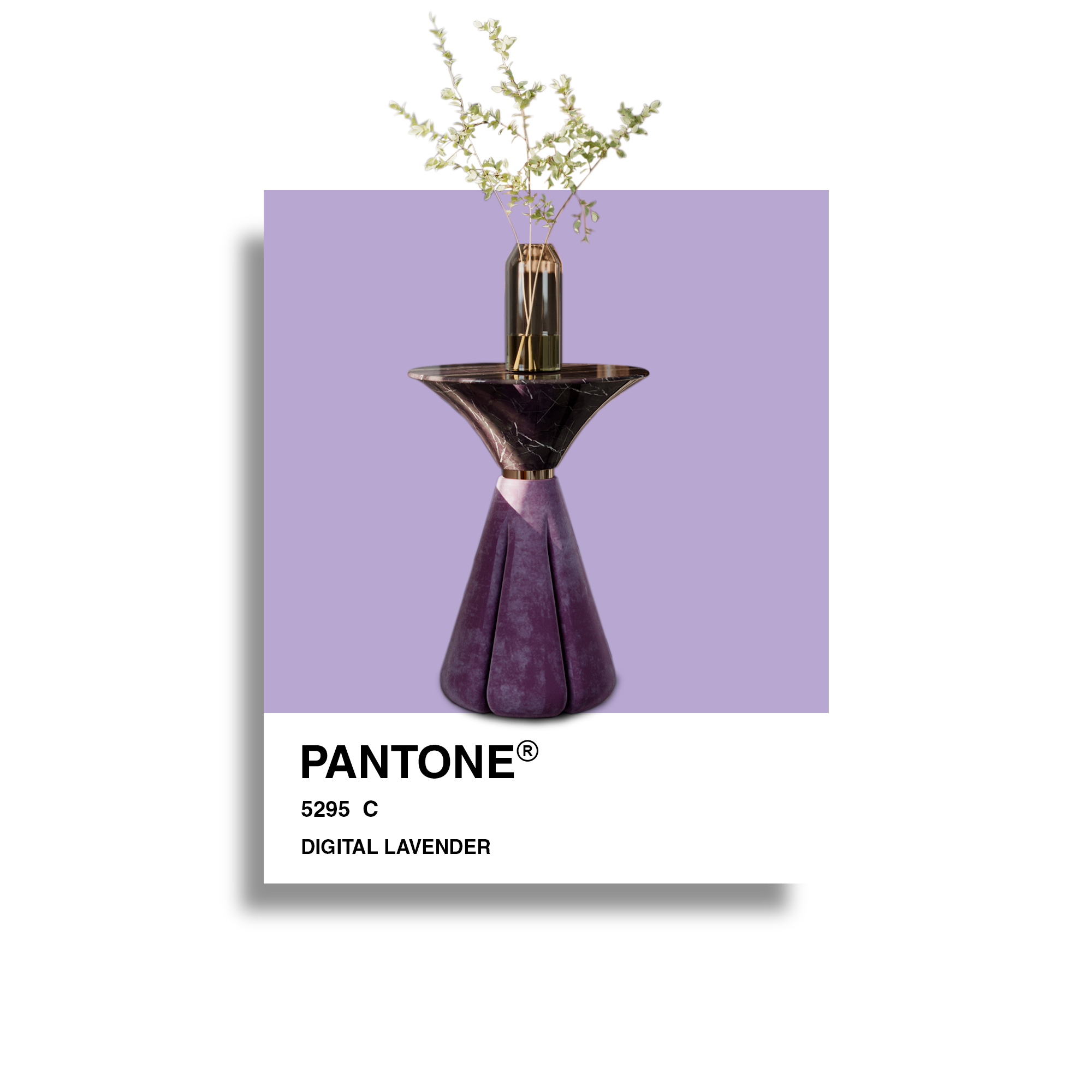
After Very Peri was the Color of the Year 2022 for Pantone, WGSN, and Coloro chose lavender/lilac as the main color trend in interior design for 2023. Digital lavender is a lovely and calming purple that brings a sense of balance. In addition, color studies indicate that tones with a shorter wavelength, such as Digital Lavender, evoke calm and serenity.
A color that can condition interior decoration but which has been increasingly sought after to convey feelings of tranquillity and spirituality. Digital Lavender, the 2023 Color of the Year for WGSN, is closely linked to digital well-being and escapism, with a calming and balancing property that connects it directly to an international movement related to mental health. So, this tone will be used in rest contexts, namely bedrooms and living rooms. How to use Digital Lavender? You can apply it to specific decoration objects, such as lamps, pillows, decorative pieces, or even an entire wall. Digital Lavender is color designers use in a fresh and contemporary aesthetic, bringing a new dynamic.
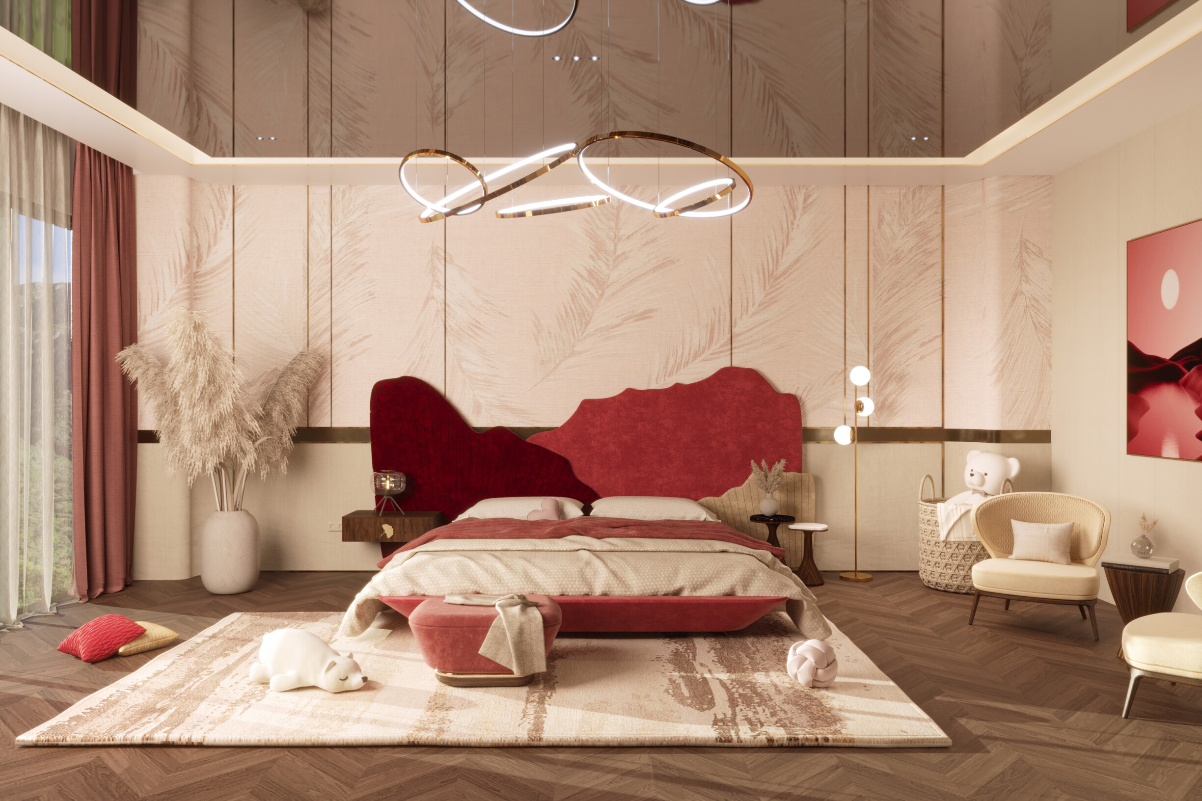
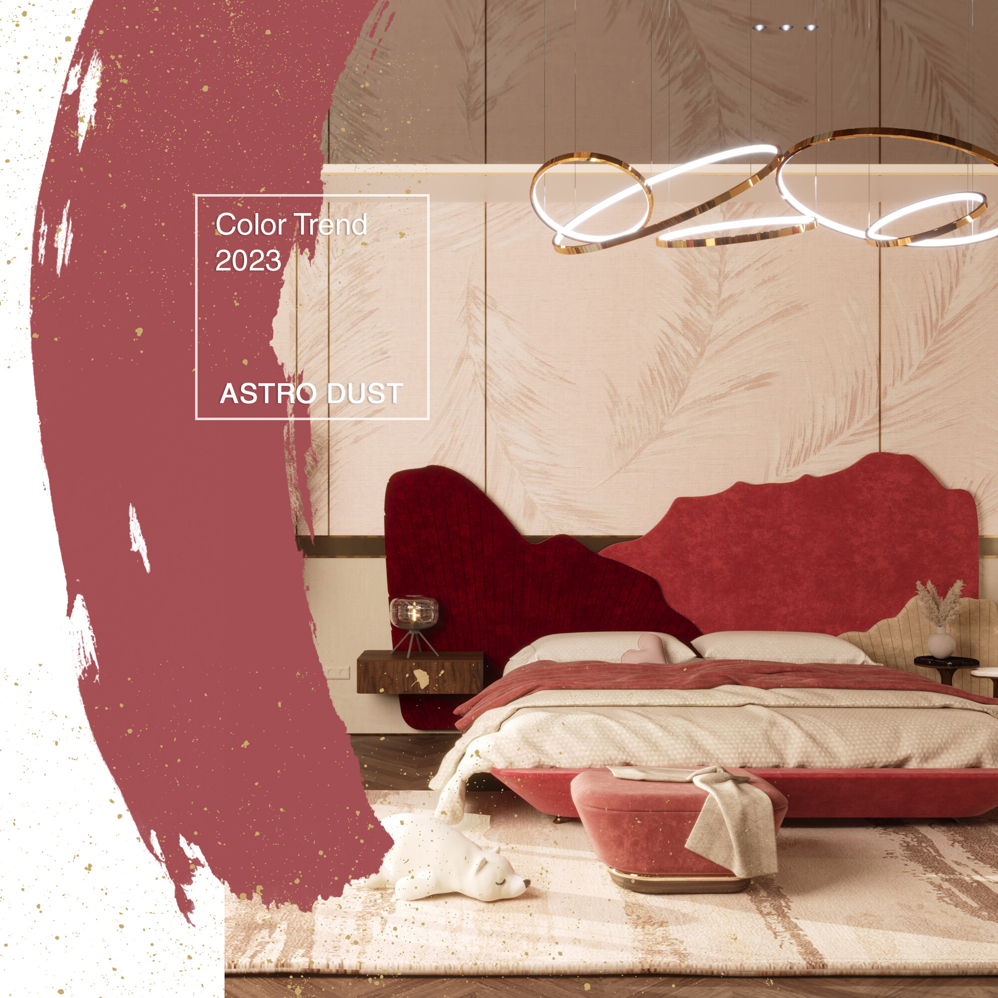
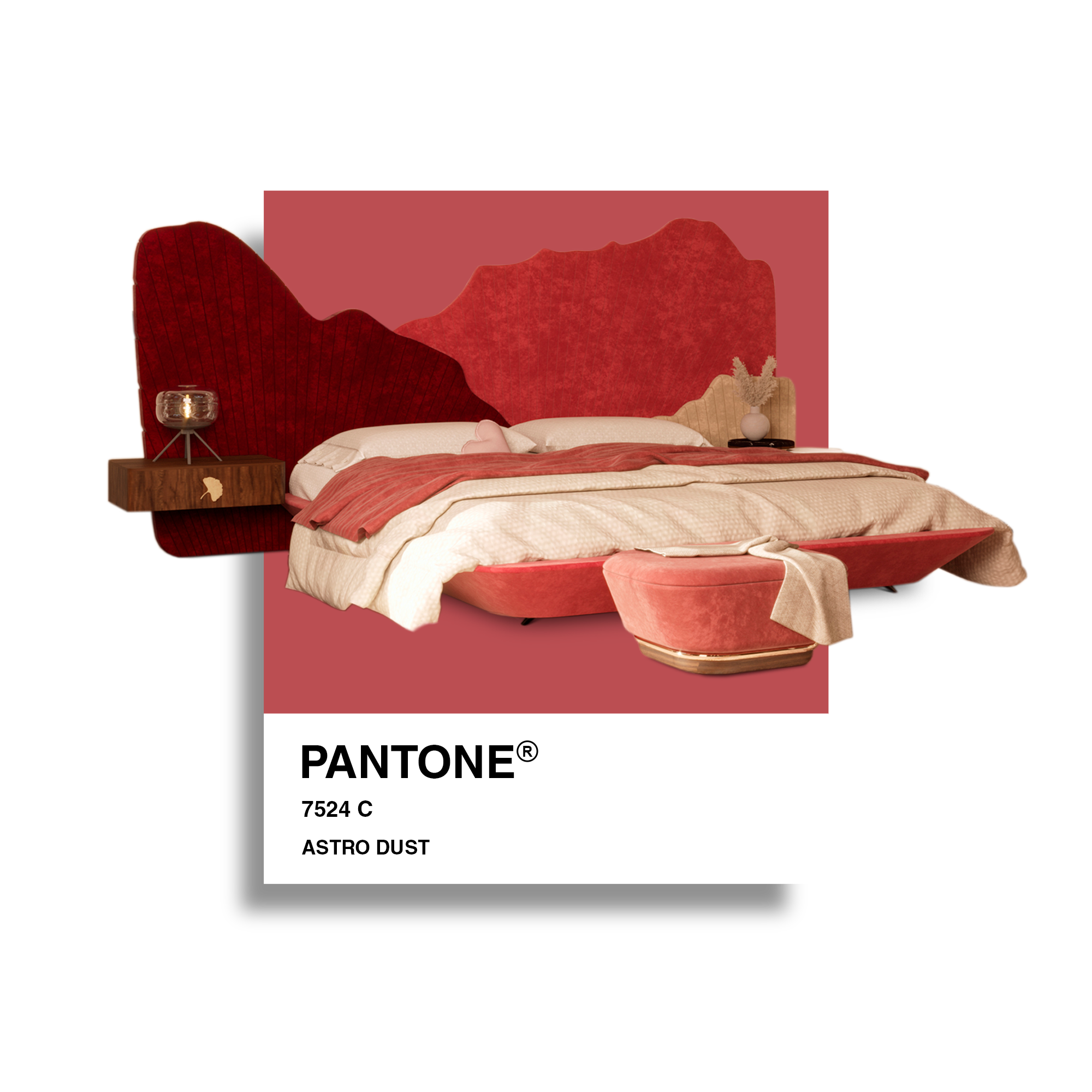
Is there a more captivating color than red? There is Astro Dust. It can be defined as a deep reddish brown tone that works perfectly with glossy finishes, woods, and plants, especially in more sober and elegant environments. This mid-tone red version connects with space exploration and the increasingly popular space tourism. Faced with this new reality, the colors of the universe excite us and inspire interior decoration, evoking the dusty and desolate landscape of Mars in a will and desire to explore remote lands and planets.
How to use Astro Dust? Our suggestion is in large-scale furniture, bedding, dining utensils, or, more innovatively, jute and rattan rugs. Do you want to transform your decor with contemporary rugs? Then, follow our tips in this blog article.
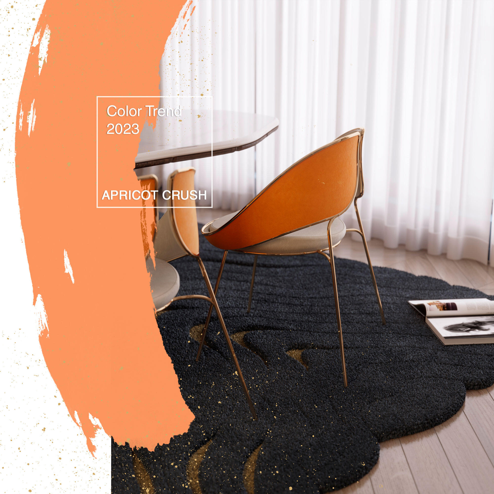
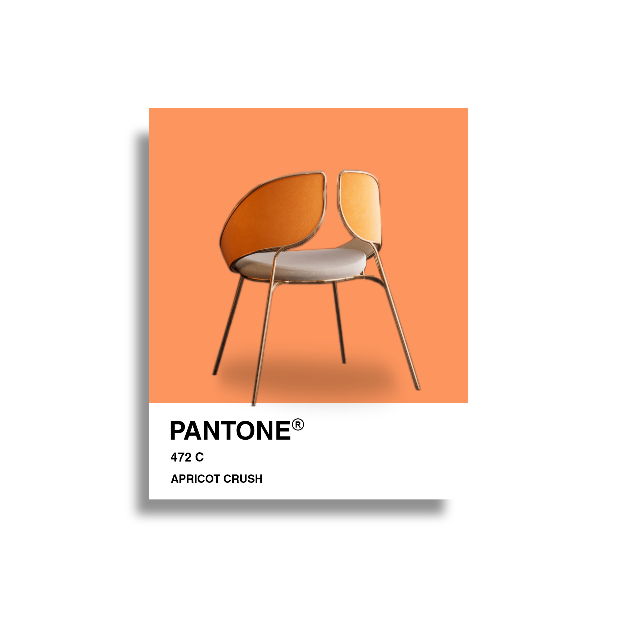
An activating medium shade with a restorative quality that aligns with the balance of lifestyles, body, and mind. Apricot Crush resembles a peach shade with a lighter background. Its versatile and cheerful tone gives any environment energy and a good mood.
Apricot Crush is the tone combined with neutral colors in several rooms, from the living room to the bedroom and home office. It is one of the most popular colors for both indoor and outdoor environments, guaranteeing a welcoming light to the home. On the other hand, as it provides comfort and warmth, it is also widely used in decorative pieces and textiles.
A more irreverent way to apply this tone in your interior design projects is on the walls, creating a calming space that reflects palettes commonly used in Mediterranean and Spanish interiors.
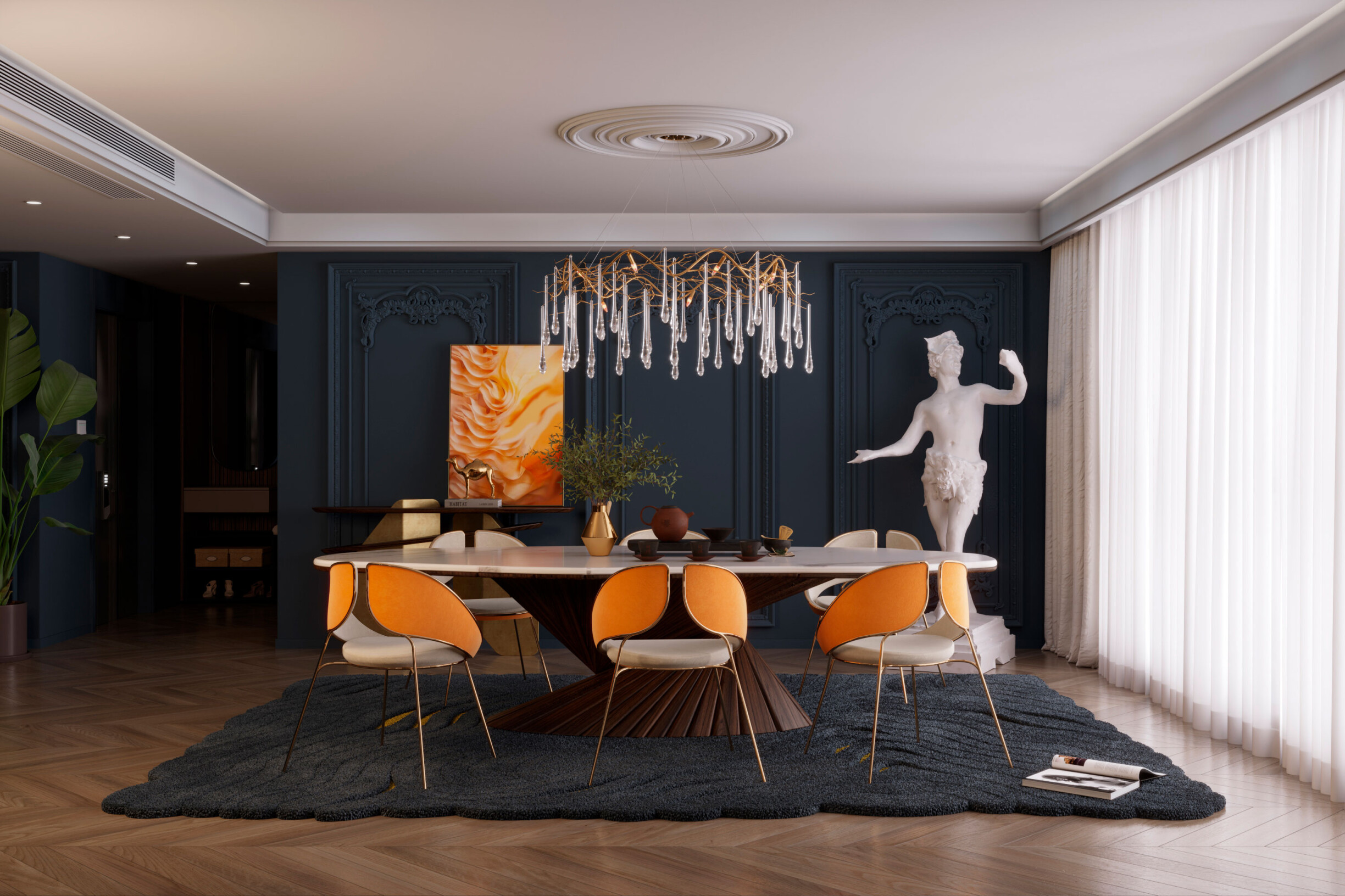
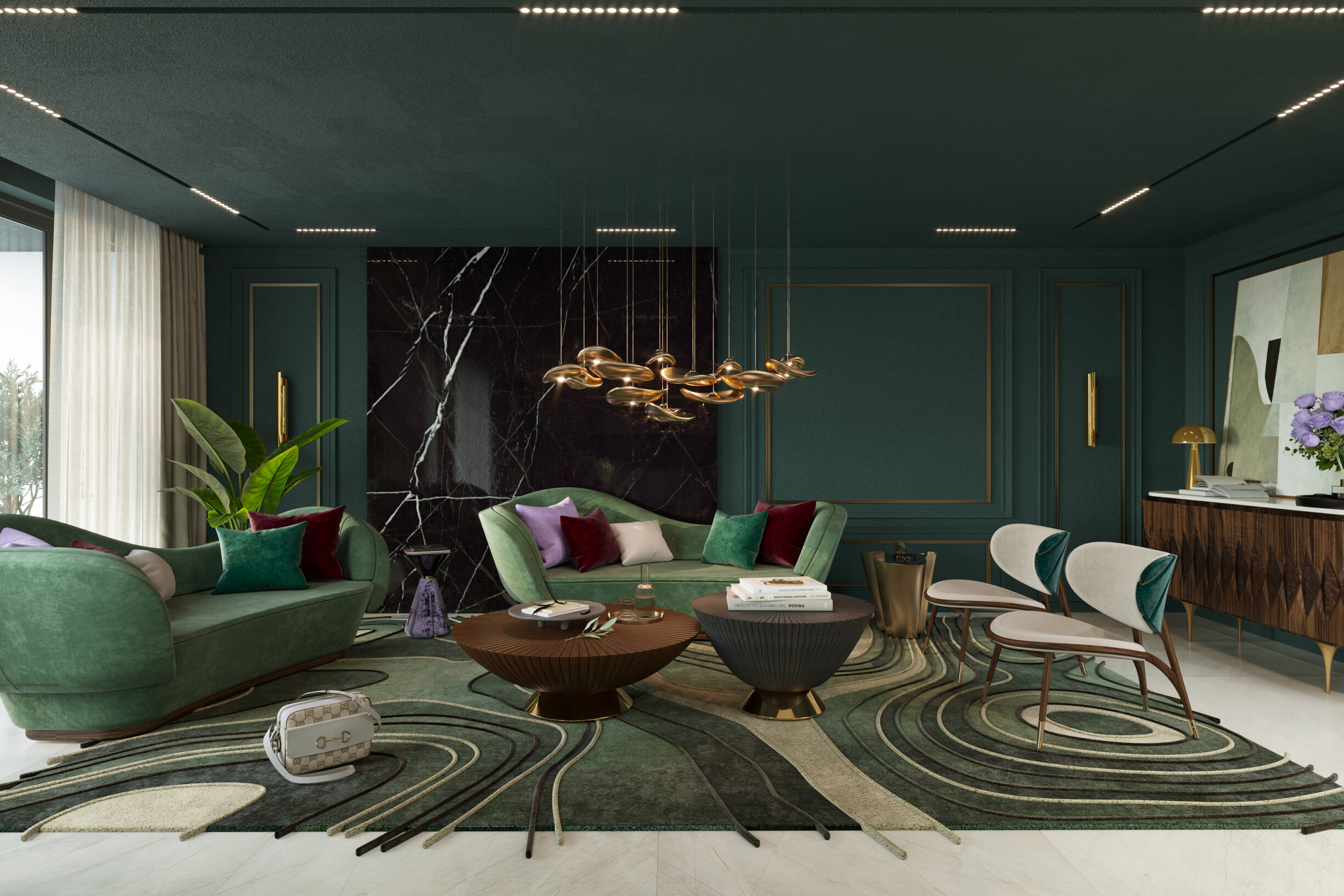
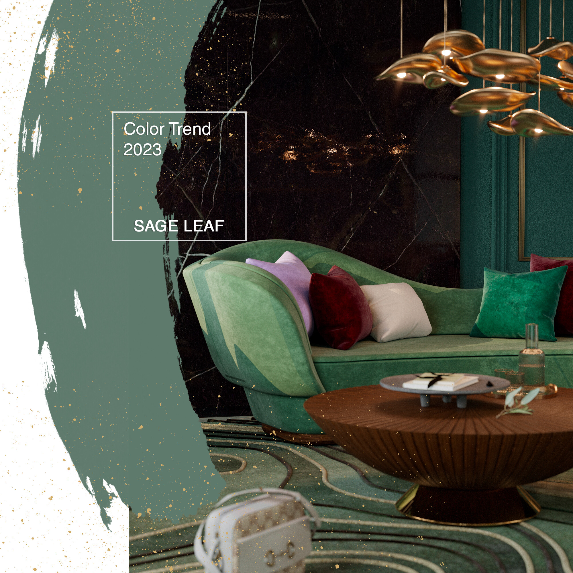
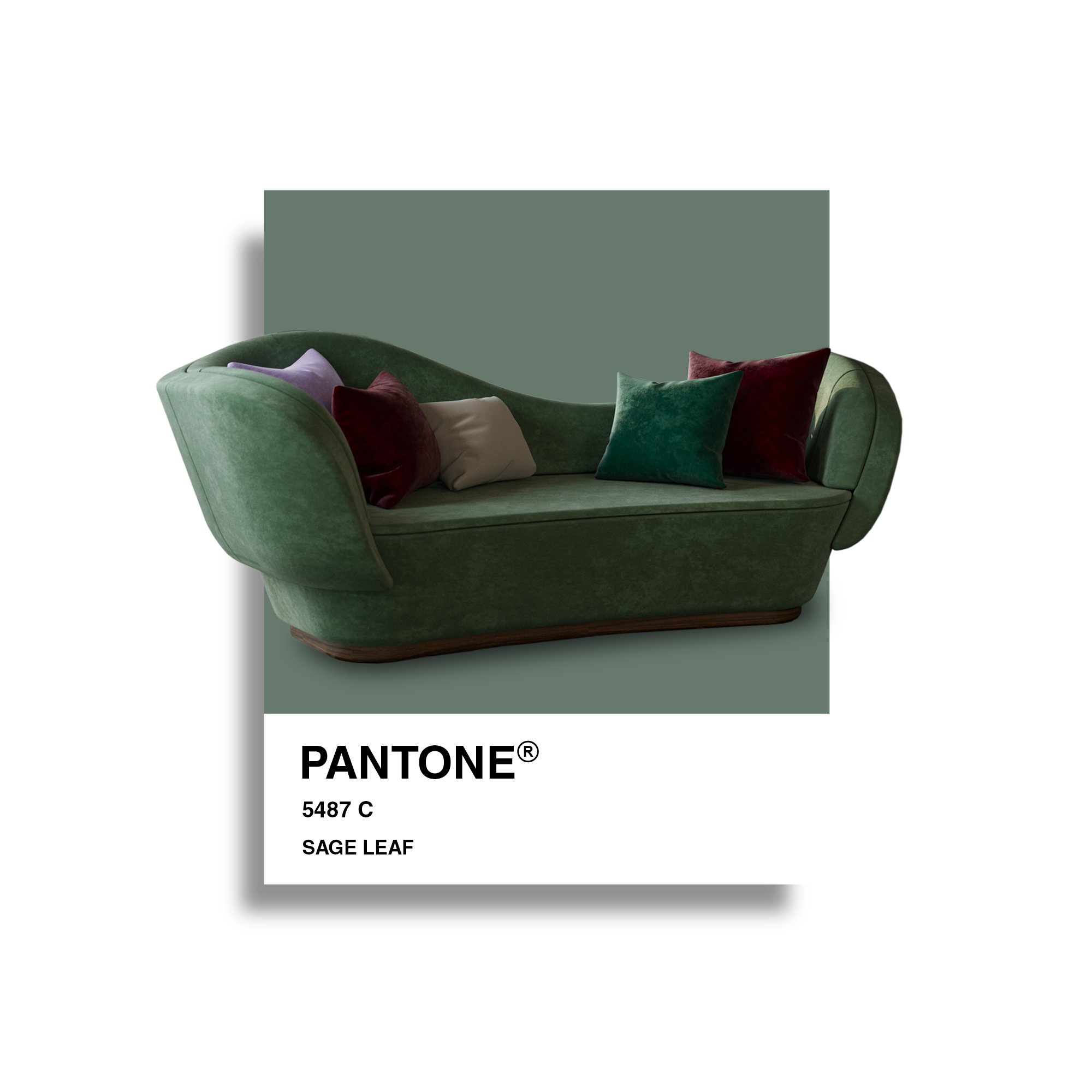
Sage leaf is a color that contrasts with almost all the previous ones. Because of this color, it represents a break from the world of technology. The last few years have brought the trend of naturalism and the appreciation of slower lifestyles. Therefore, consumers look for interiors and colors that reduce anxiety and stress levels in the brain, which is achieved with Sage Leaf.
In reductive and thoughtful designs, namely on walls, furniture, and decorative pieces, Sage Leaf can be present in almost every room in a home. It is a peaceful, calming green that instills a sense of contemplation, rest, and reflection. It is an elegant color, so it is an excellent option to innovate without exaggeration. Perfect for adding a touch of color to the decor without fearing leaving the space too colorful, for example, through a piece like the modular sofa Mies from ALMA DE LUCE or Longjing rug.
"There is something inherently human about colors that attract us. It all depends on the aesthetics you want to apply. The decor is moving forward and is inspired by the modest character of the world, using tones that exalt the virtues of a simple life and that can be used in any combination and any environment", said Joa Studholme, color curator at Farrow & Ball, in an interview for the website Livingetc.com, specialized in interior design. You can use The five trend colors for 2023 in different decoration and interior design projects.
You can, for example, choose one of these colors on a wall or even apply wallpaper with a trending tone. Still, remember that darker shades, like Galactic Cobalt or Sage Leaf, visually reduce a smaller room, and lighter shades, like Apricot Crush or Digital Lavender, can enlarge the space.
Another excellent tip for you to use these trendy colors is to combine them: yes, at first glance, they may seem like colors that cannot be mixed, but it is possible to create fantastic interiors by contrasting Sage Leaf green with the more peach Astro Dust tone, for example. Use your imagination!
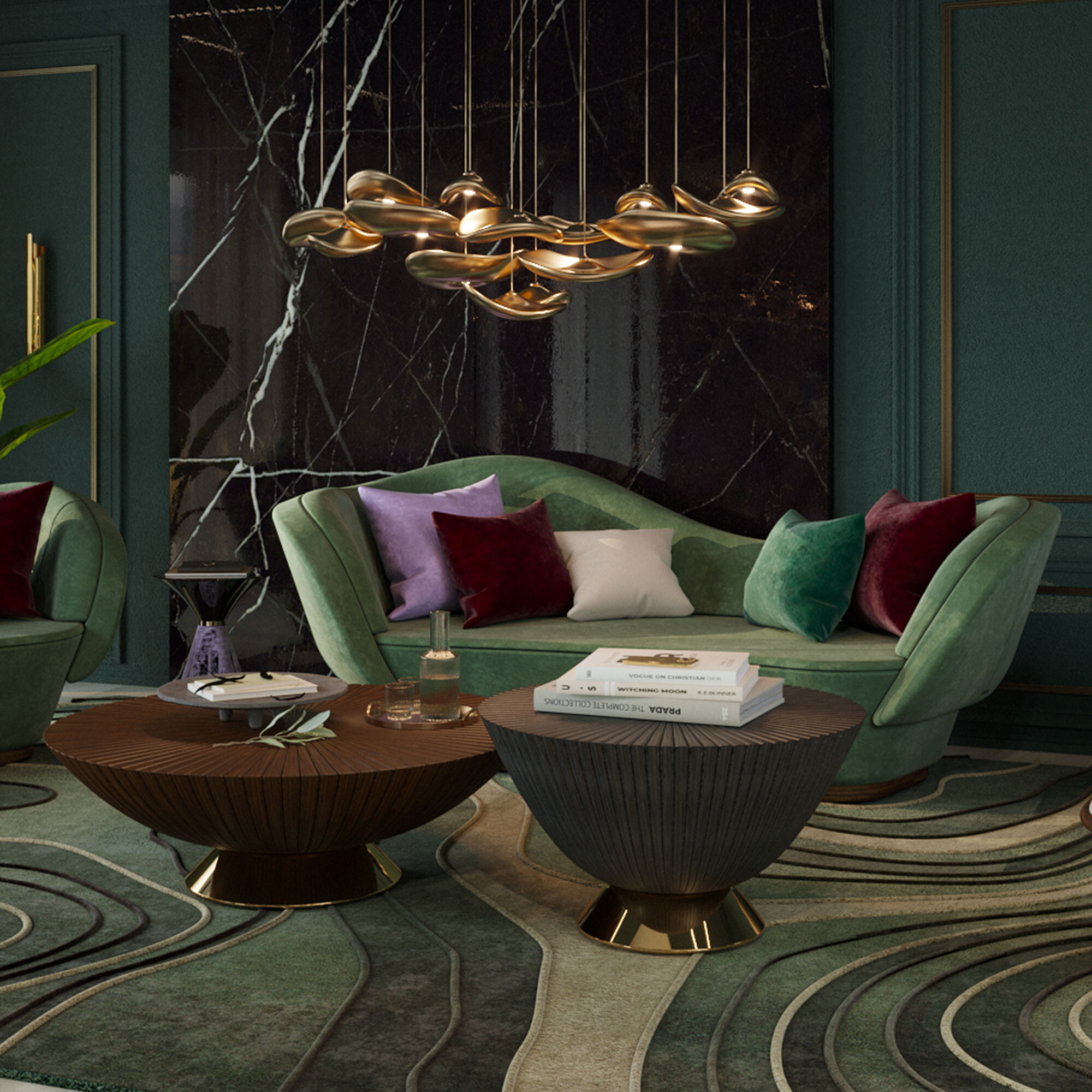
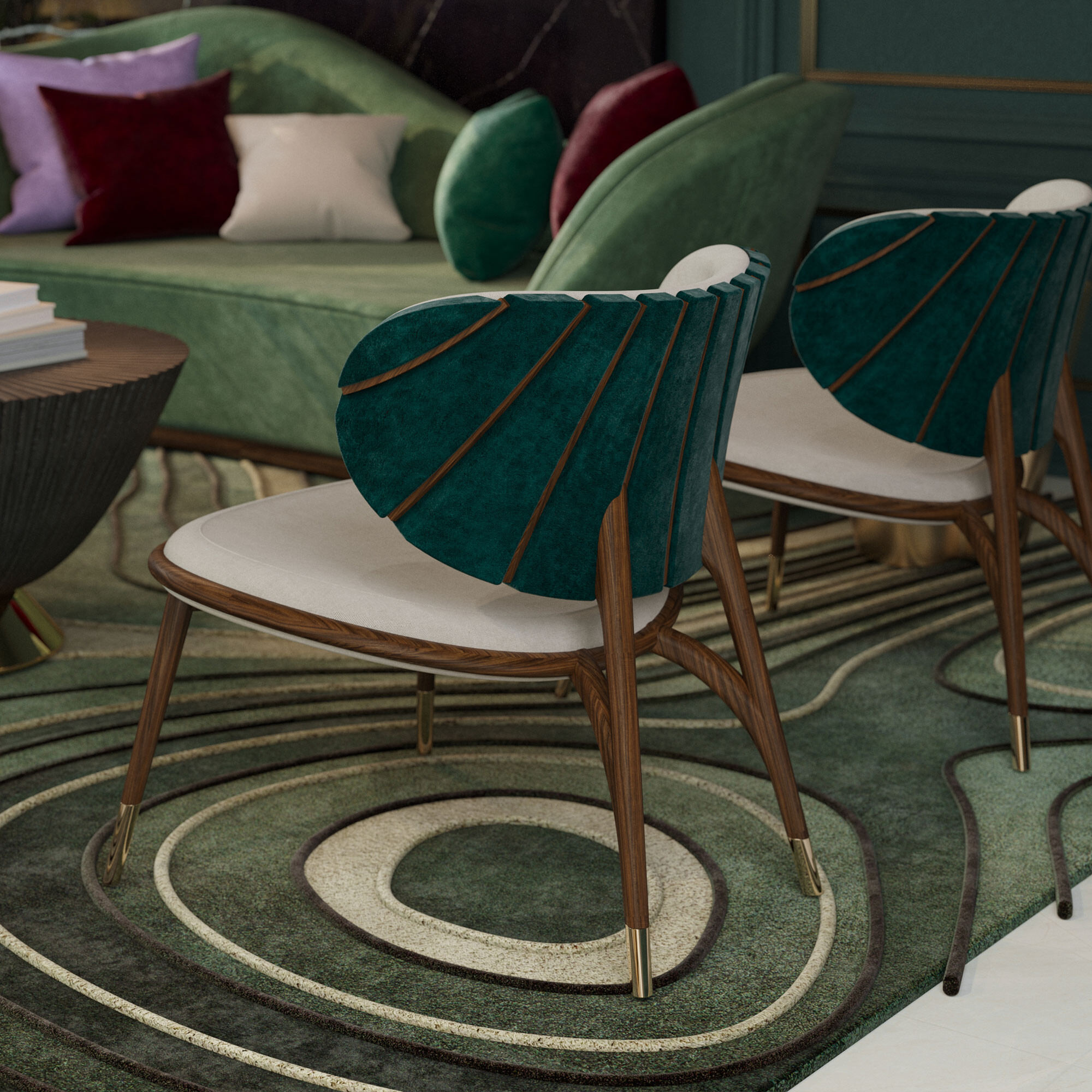
With all these ideas and new 2023 color trends info, you will be inspired to upgrade any room in a house. You can create a mood board or get inspiration to create cozy, sophisticated, and elegant spaces.
Did you like our tips? So, stay tuned to our blog for more information and curiosities from the universe of architecture, interiors, and design! We are attentive to the latest news in the sector to give you all the necessary information.
You can also follow us on Instagram, Facebook, and Pinterest for all updates.